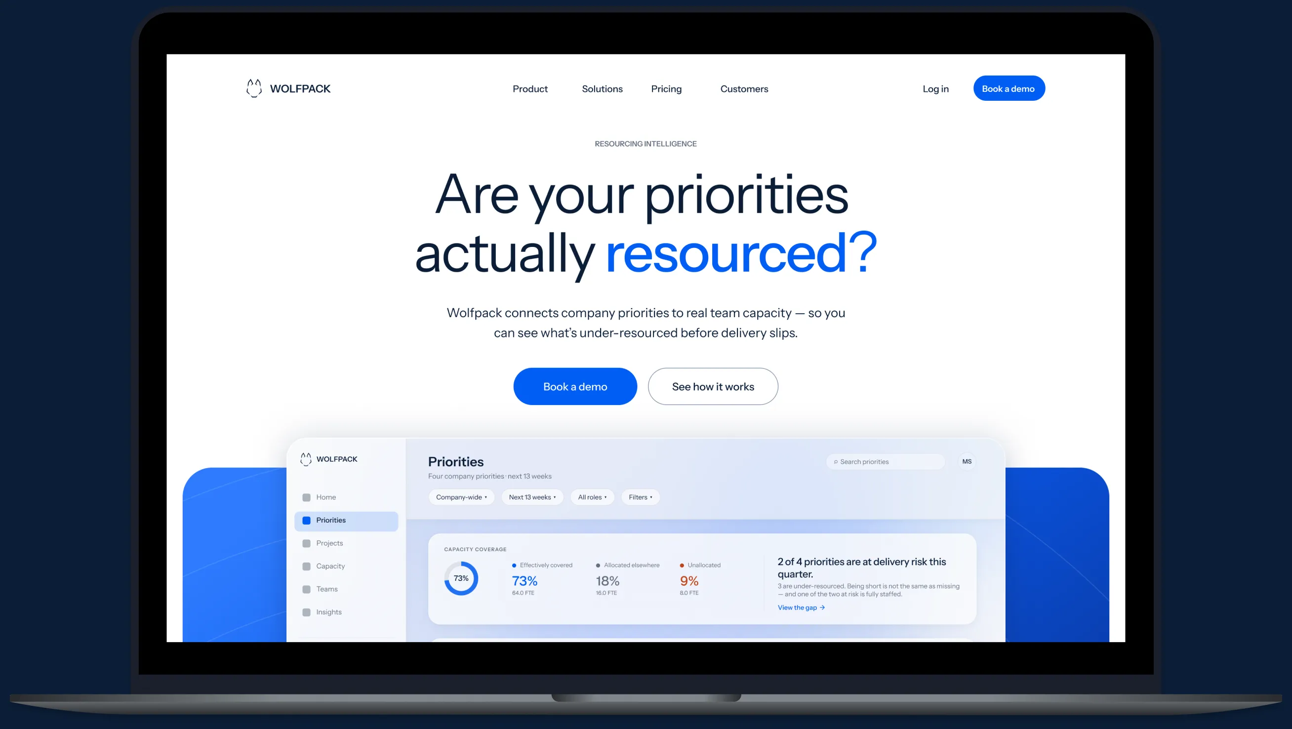
The concept
Wolfpack is a self-initiated resourcing-intelligence concept for growing teams. The product connects company priorities to the capacity actually available to deliver them — revealing gaps before they become delivery problems.
Self-initiated concept
Building a B2B SaaS brand around one uncomfortable question: are your priorities actually resourced?
The concept
Wolfpack is a self-initiated resourcing-intelligence concept for growing teams. The product connects company priorities to the capacity actually available to deliver them — revealing gaps before they become delivery problems.
My role
I developed the concept from the ground up across brand strategy, visual identity, marketing website, product-marketing visuals, campaign and social, event design, and collateral.
01 / The company
Most work-management tools tell you what’s happening. Wolfpack asks whether the priorities leadership says matter most actually have the capacity behind them.
Work management with resourcing intelligence.
02 / The product story
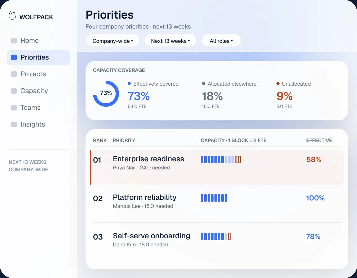
Three views turn resourcing into a simple story: what matters, who can support it, and where the plan breaks. Together, they expose delivery risk before deadlines slip.
See the work
Projects, priorities, and what the business is asking teams to deliver.
See the people
The real capacity, allocation, and availability behind that work.
See the gap
The shortfall between what the priority needs and what the organization can actually support.
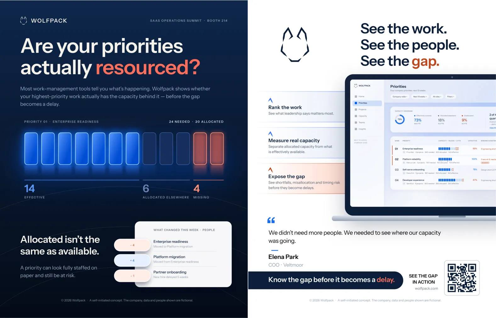
01 · ENTERPRISE READINESS · Q4
24
NEEDED
20
ALLOCATED
4
MISSING · ENGINEERING
03 / Identity
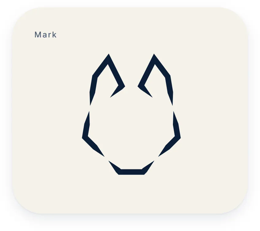
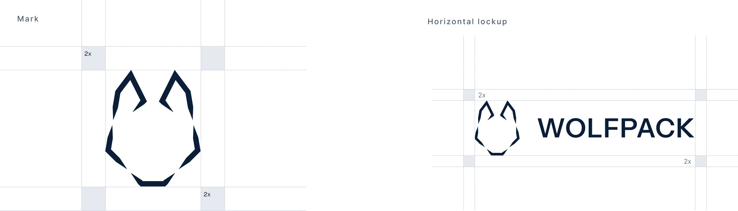
I built the Wolfpack mark from five straight geometric fragments and a constrained angle set, using negative space to form the wolf. The same angular logic carries into supporting brand details and applications.
The identity is intentionally restrained: precise, direct, and calm enough to deliver uncomfortable information without drama.
Correct usage

Off-white on navy
Correct

Blue mark
Blue is for coverage
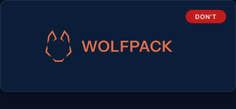
Orange mark
Orange is for risk
04 / Color
Deep navy and a pale cool tint create a calm, analytical foundation. Blue marks alignment and coverage; orange isolates discrepancy and risk. The accents are intentionally limited — Wolfpack should never look alarmist, even when the information it delivers is uncomfortable.
One accent, two values
Neither accent meets contrast requirements across both grounds, so each has a base value and an accessible shifted value. The meaning stays consistent; only the value changes.
Blue on light
Large text + UI only
Blue on dark
Orange on light
Orange on dark
05 / Conceptual product visuals
Conceptual product UI · responsive views
Capacity became a visual language. Bright blue shows effective capacity, muted blue shows capacity allocated elsewhere, and orange isolates the gap. The same logic carries from product UI into marketing.
STEP 1
Define the unit
One block = 2 FTE. Every figure on every surface resolves to the same block.
STEP 2
Measure the gap
73% covered isn’t the story. 4 full‑time equivalents short is.
STEP 3
Author per width
A desktop dashboard can’t stay legible on a phone. Each width got the technique it could carry.
STEP 4
Prove it moves
Fills steadily, hesitates half a second, then the shortfall arrives.
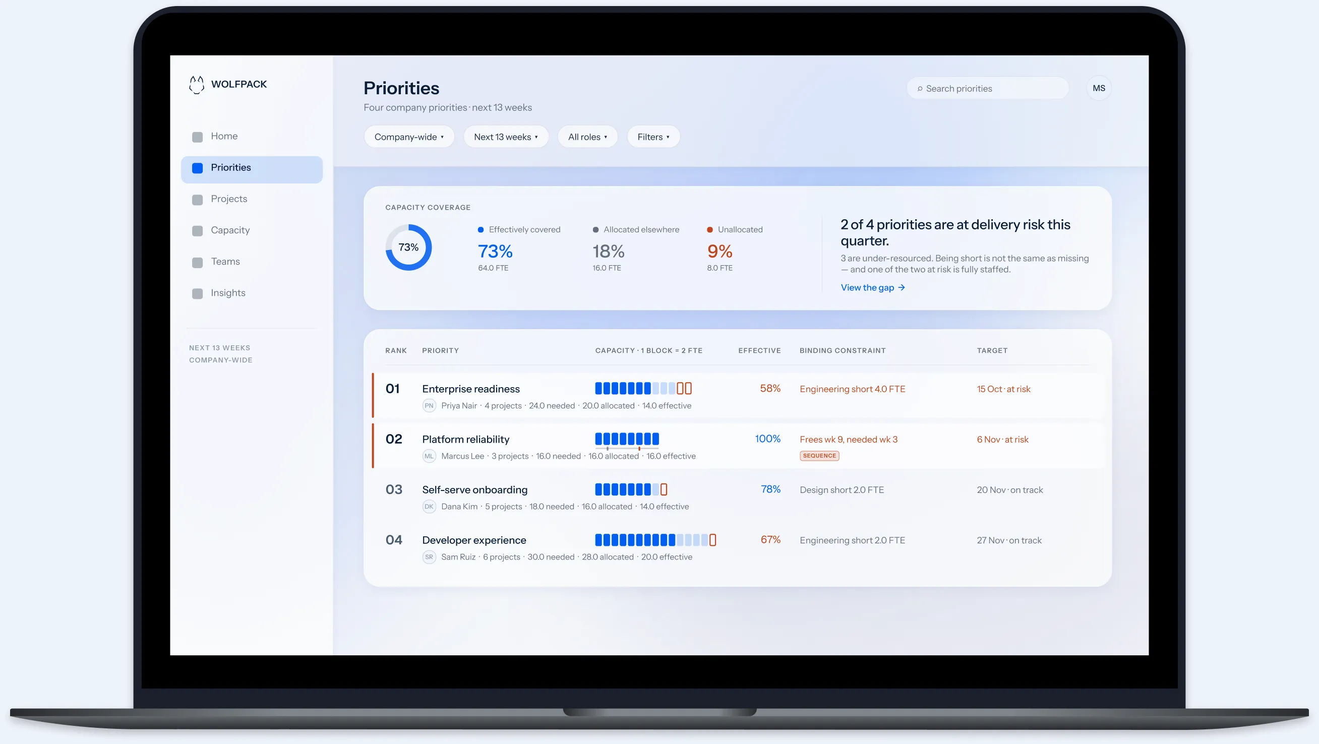
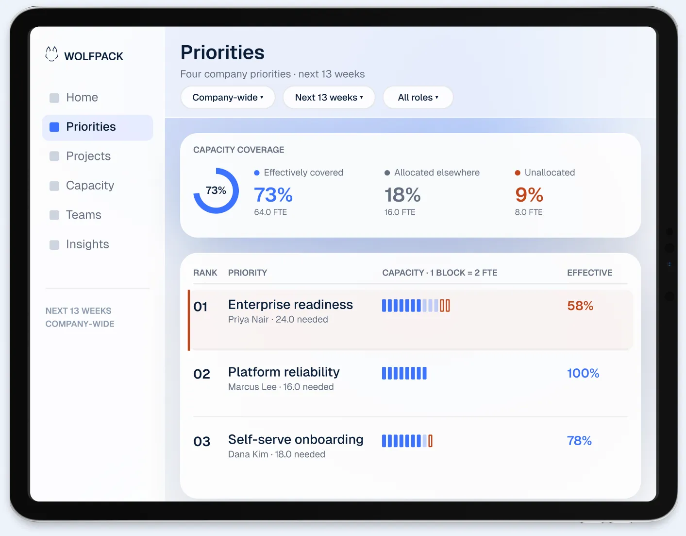
Tablet
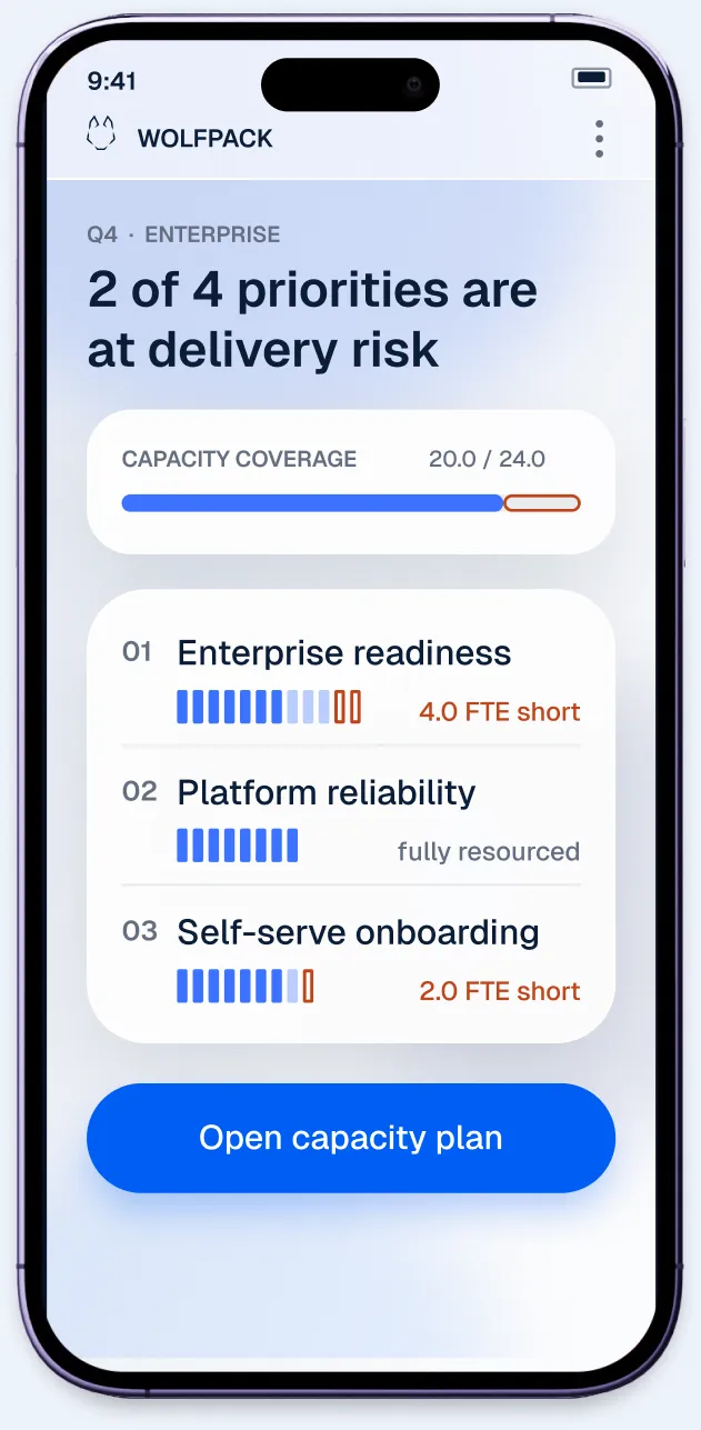
Mobile
06 / The marketing site
The product can be precise. Marketing has to be immediate. Wolfpack distinguishes needed, allocated, effective and missing capacity, then translates that logic into messages understood in seconds: 24 needed. 20 allocated. 4 missing.
I designed the site around large editorial typography, restrained product proof, and a light frosted interface system that keeps complex information approachable.
MARKETING WEBSITE
Eleven sections ordered as an argument, at three widths and in two modes.
STEP 1
Order the argument
Eleven sections: problem → proof → belief → objection → close.
STEP 2
Preserve the hierarchy
Editorial type leads, product proof supports, and Book a demo stays the one primary action.
STEP 3
Build both modes
Light and dark versions of every section, built from the same tokens.
STEP 4
Hold the ratio
Type reduces at every breakpoint. The margin‑to‑content ratio doesn’t.
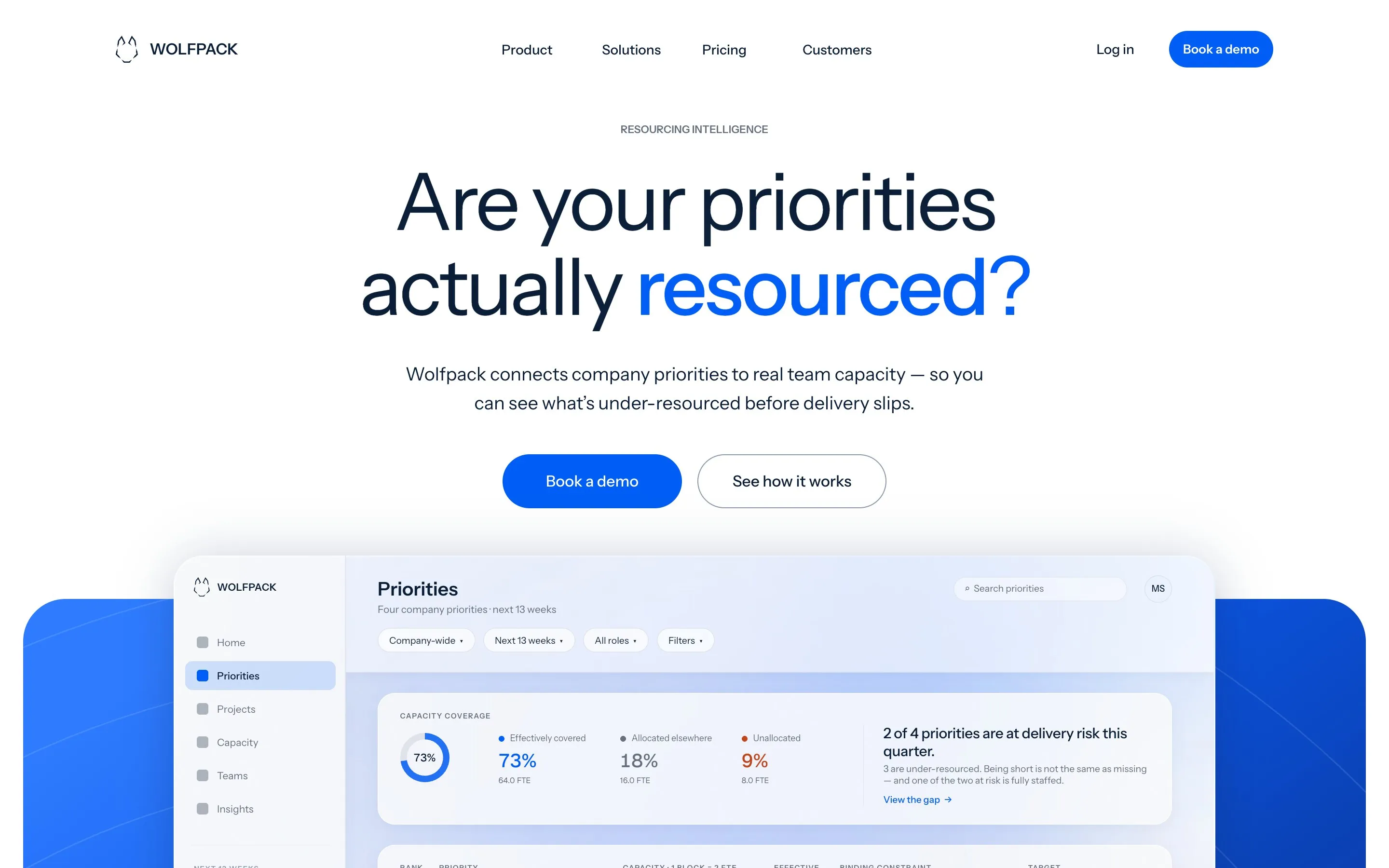
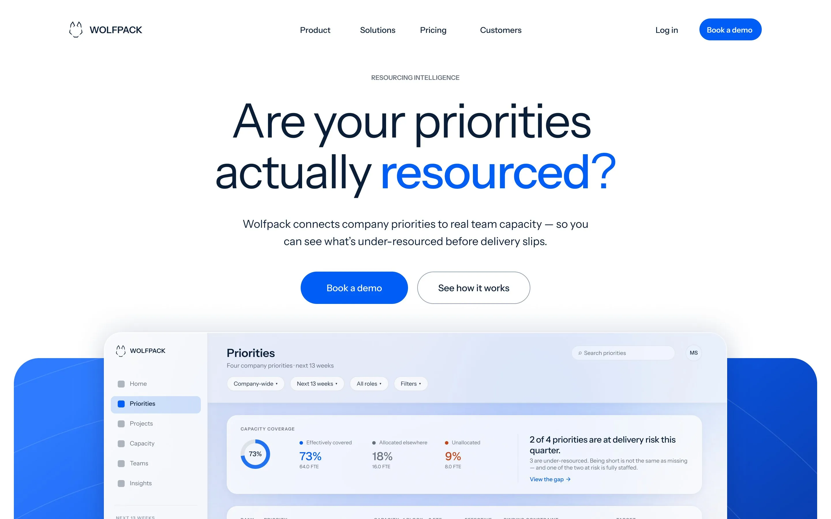
Drag in the build: the Figma master on the left, the coded site on the right — aligned pixel for pixel. Proof, not a claim.
07 / Campaign + social
The campaign system turns Wolfpack’s positioning into repeatable messages about priorities, capacity and misalignment. Every asset draws from the same system — capacity blocks, product UI, candid photography and restrained signal color — across education, launches, events and customer stories.
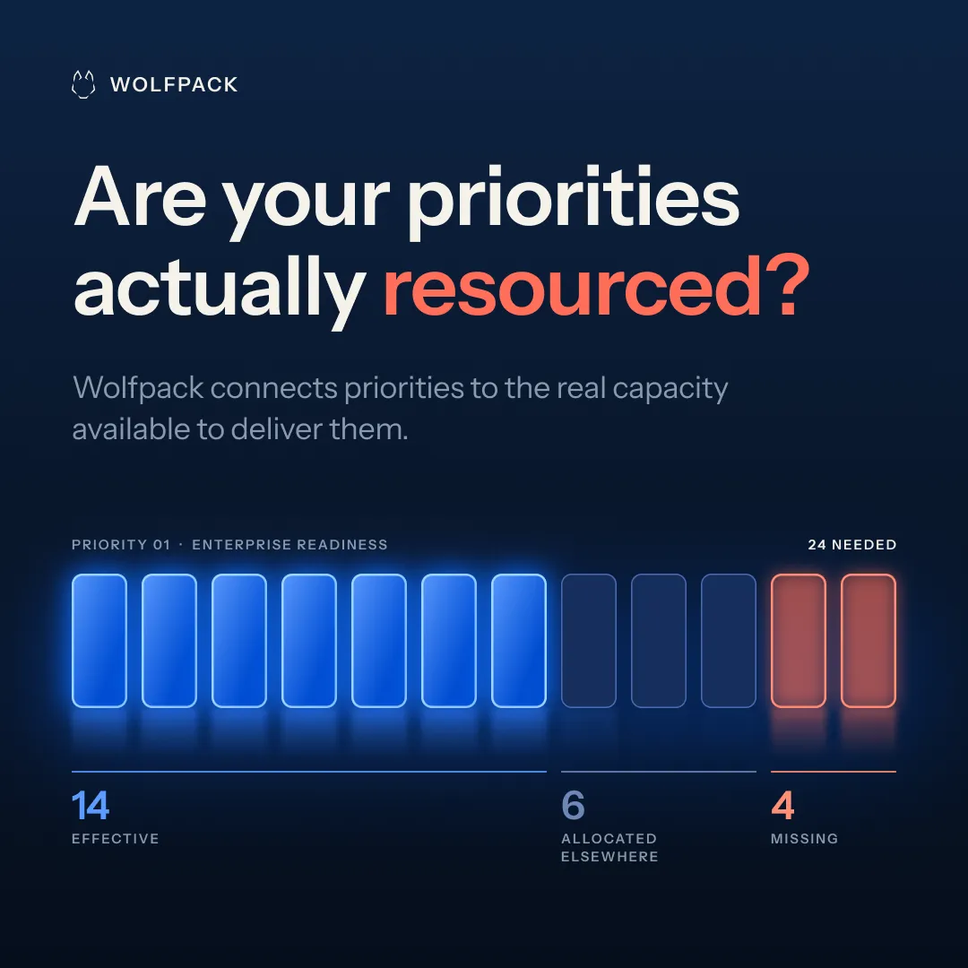
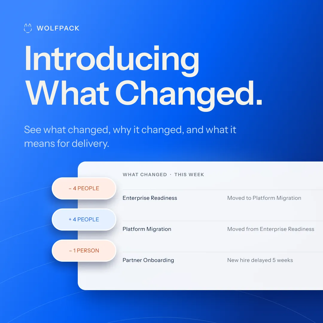
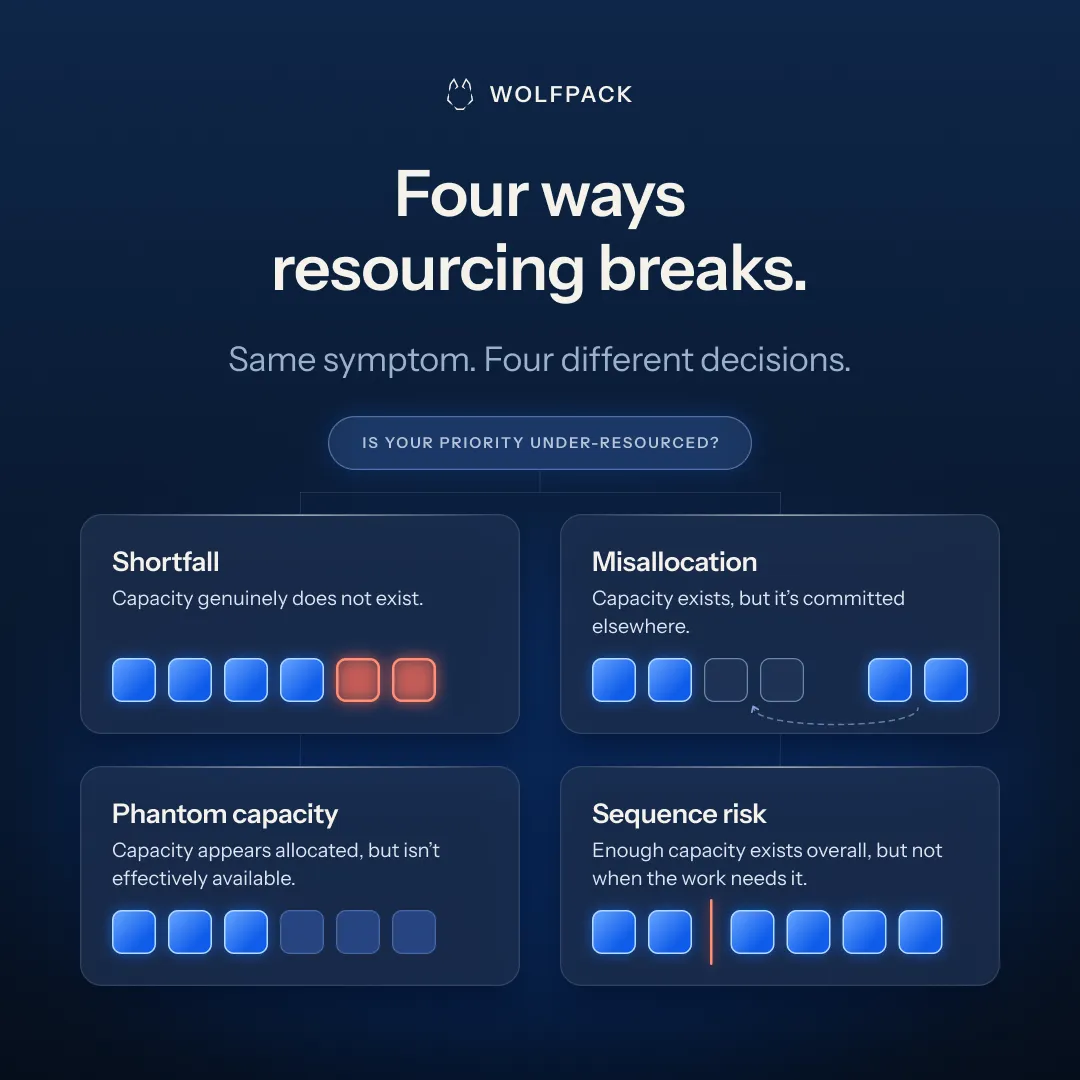
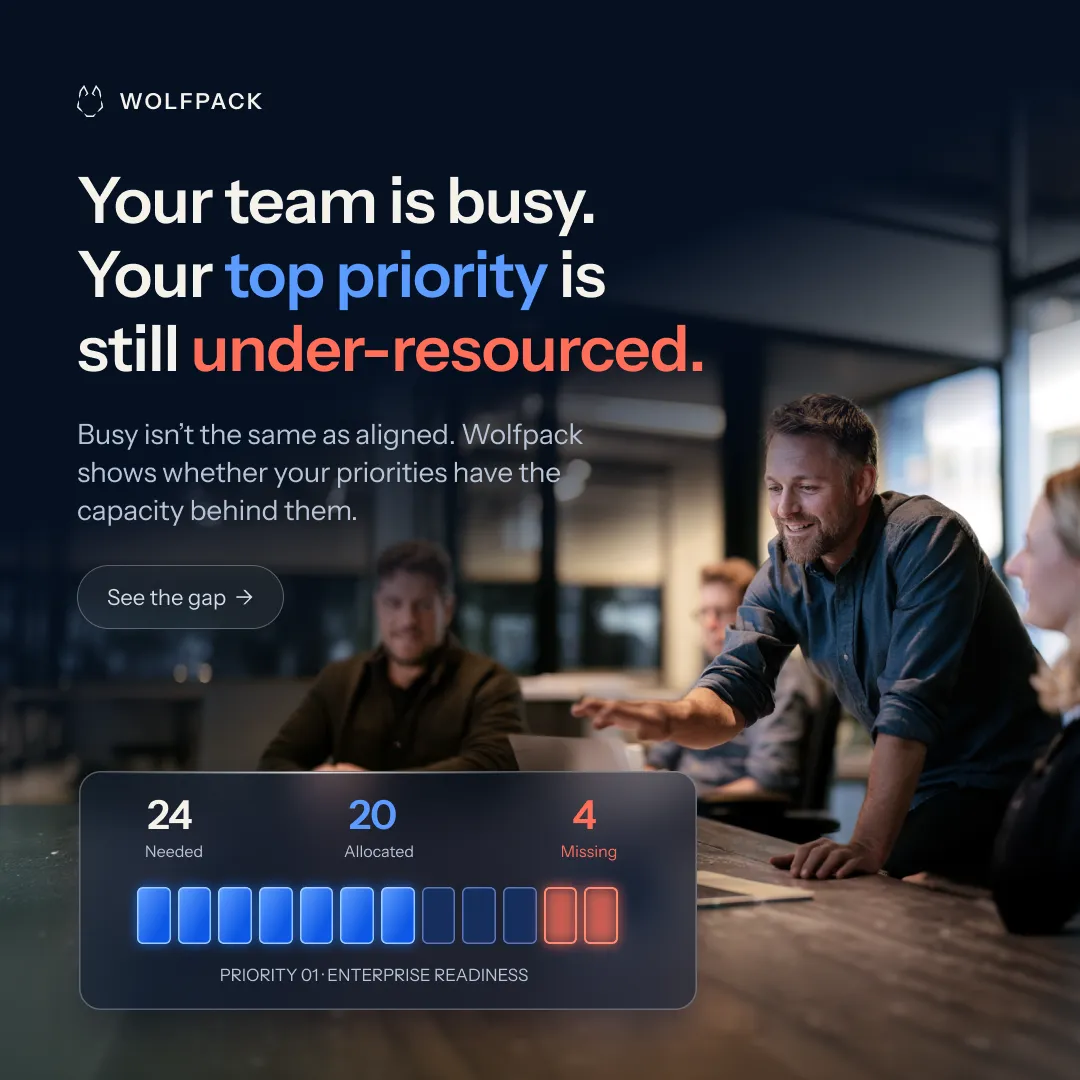
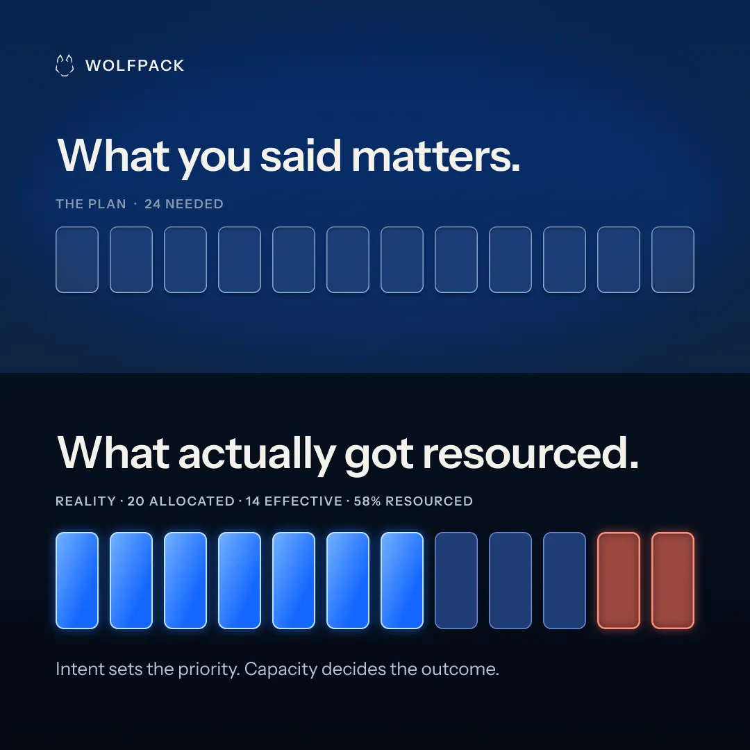
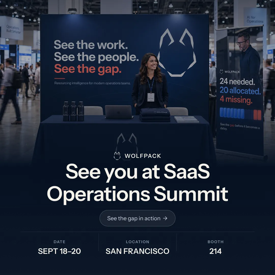
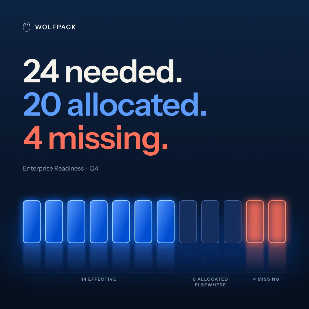
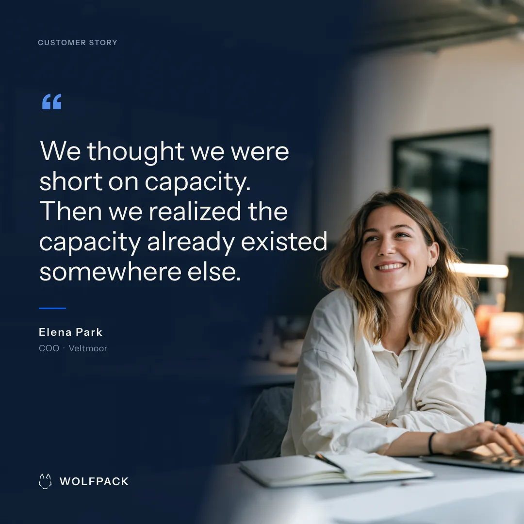
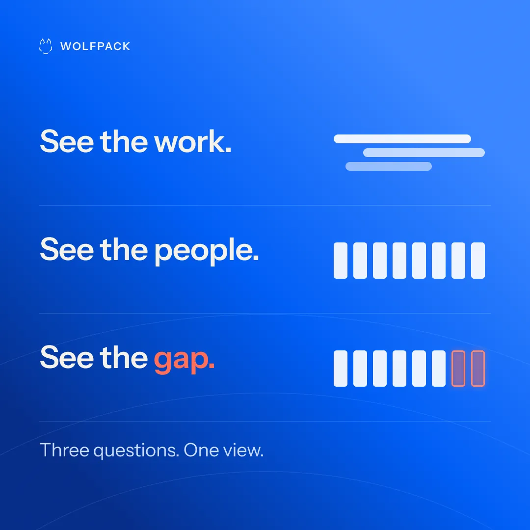
1080 × 1080 · 9 campaign applications · one visual system
08 / Event + booth
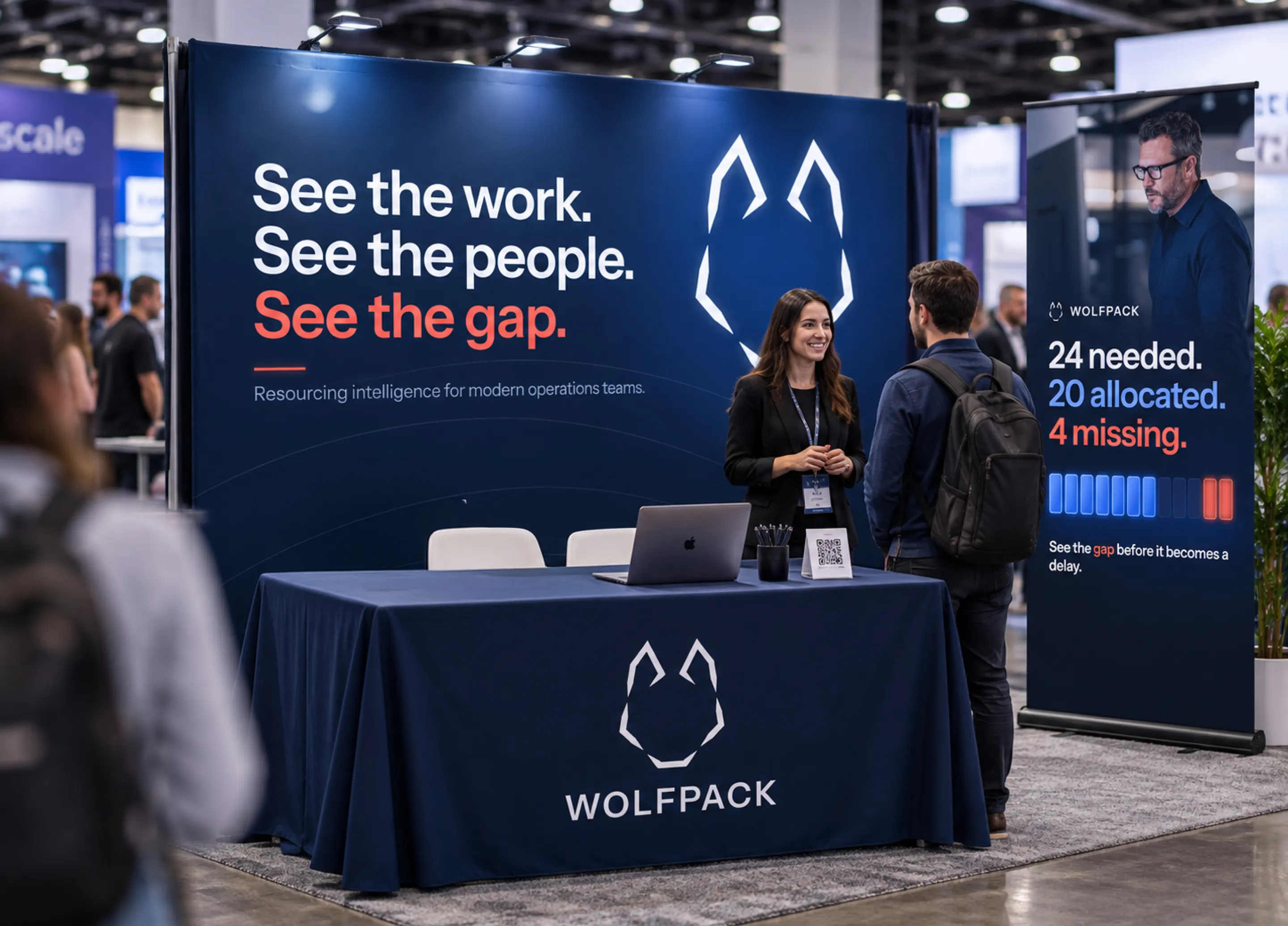
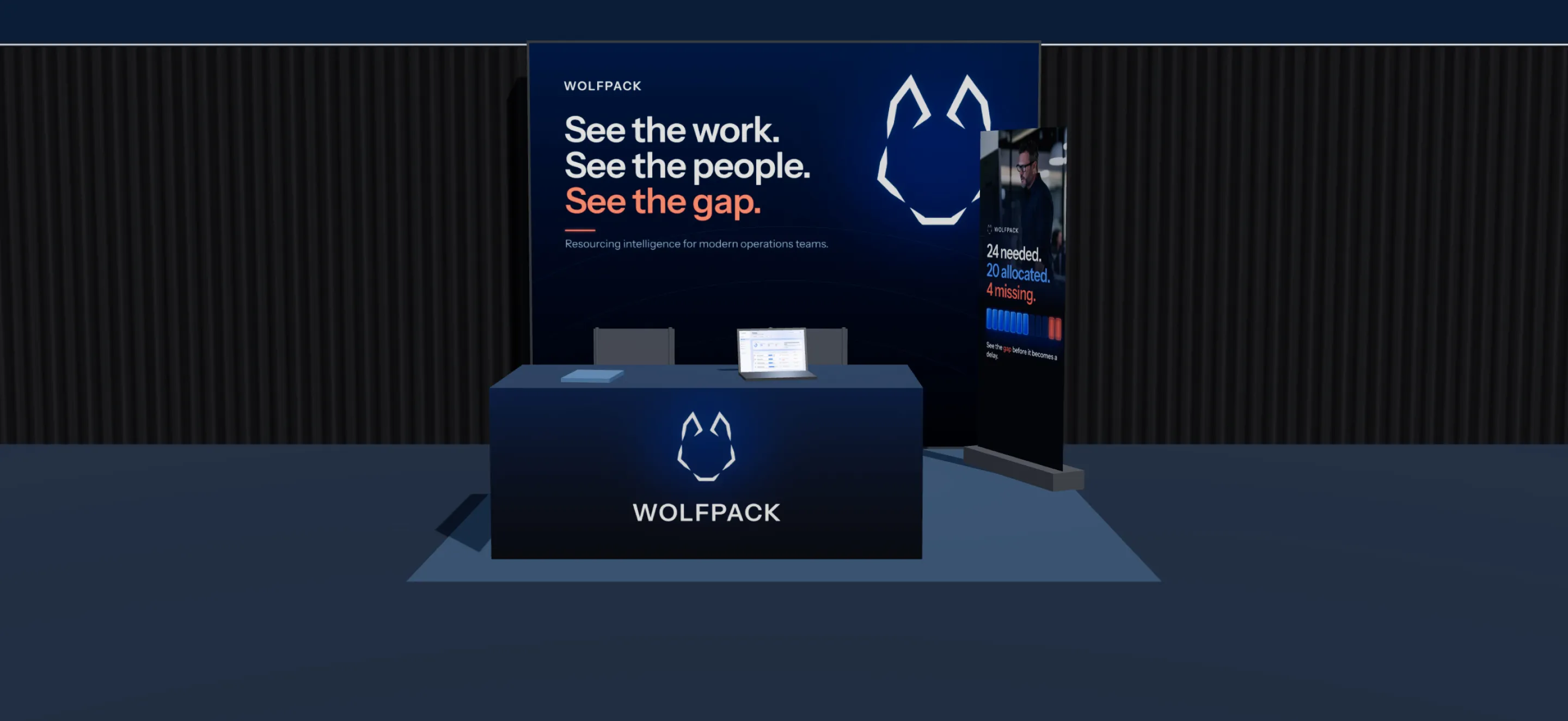
At event scale, the message had to get even simpler: See the work. See the people. See the gap. Oversized type, navy surfaces, restrained signal color and focused product proof carry the digital system into a physical environment.
Booth concept
3D booth · interactive on the live site
Drag to explore the booth. Each surface uses the final artwork at true size: 10 × 10 ft inline, backlit wall, 6 ft table and pull-up banner.
09 / Physical brand
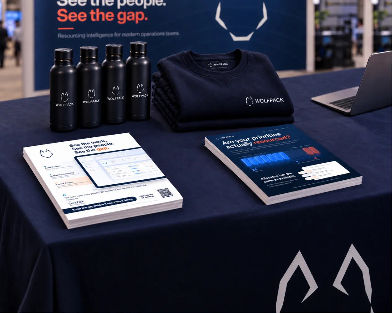
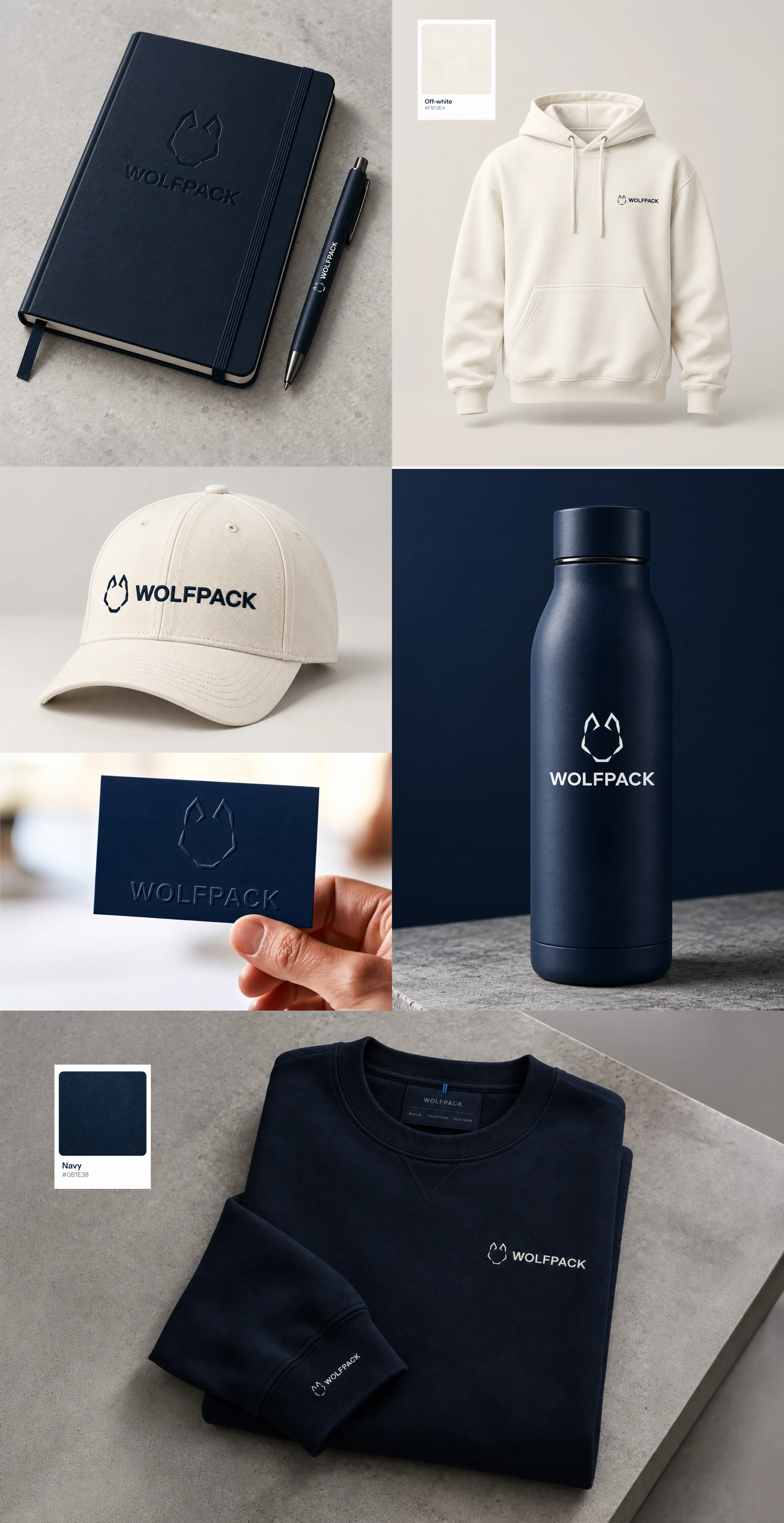
I extended the identity into apparel, stationery, drinkware and print collateral, keeping each application restrained: durable materials, minimal branding and the same navy/off-white system used across the digital work.
Merch
10 / In closing
Wolfpack began as a self-initiated SaaS brand concept, but the goal was to build enough of the company behind the identity that every design decision had something real to respond to. The result is one system carried across positioning, product storytelling, web, campaign, event and physical brand.
The company, data, scenarios and people shown are fictional. The strategy, systems and design decisions are original, and shared examples are internally consistent.