The concept
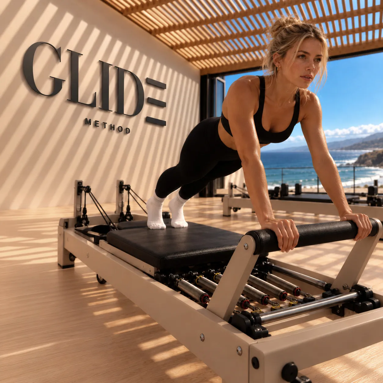
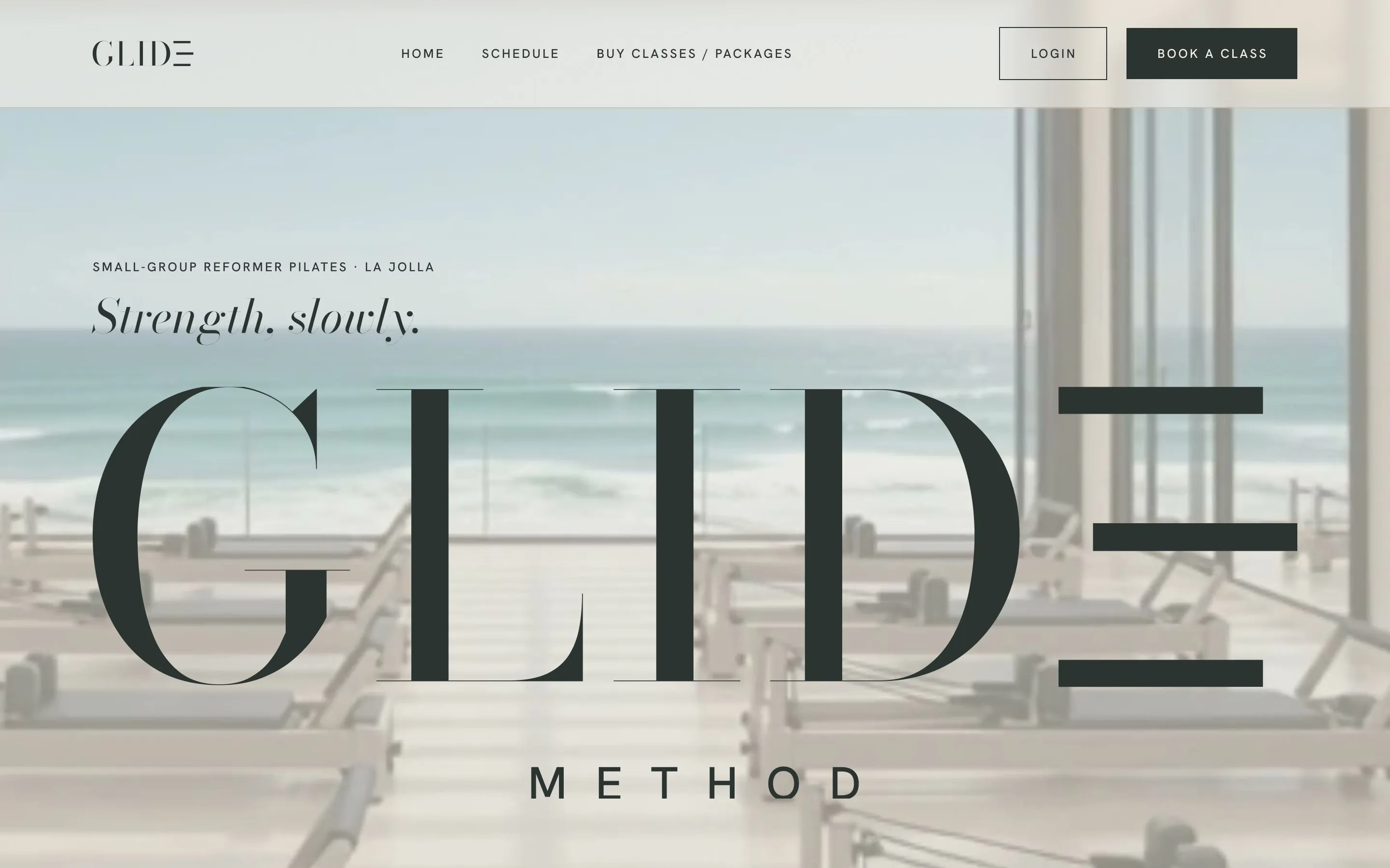
GLIDE METHOD is a reformer Pilates concept for La Jolla, built around a simple tension: the workout is intense; the environment is quiet.
Self-initiated concept · Wellness
A reformer Pilates studio shaped by movement, light and place.
The concept
GLIDE METHOD is a reformer Pilates concept for La Jolla, built around a simple tension: the workout is intense; the environment is quiet.
My role
I developed the concept end to end: positioning and naming, visual identity, art direction, AI-assisted imagery, website and app design, launch campaign, and a custom 3D reformer model.
01 / The idea
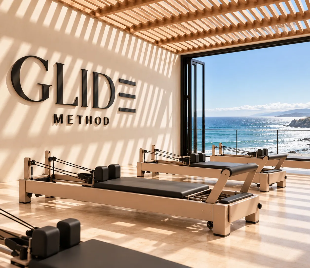
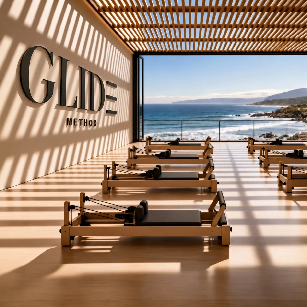
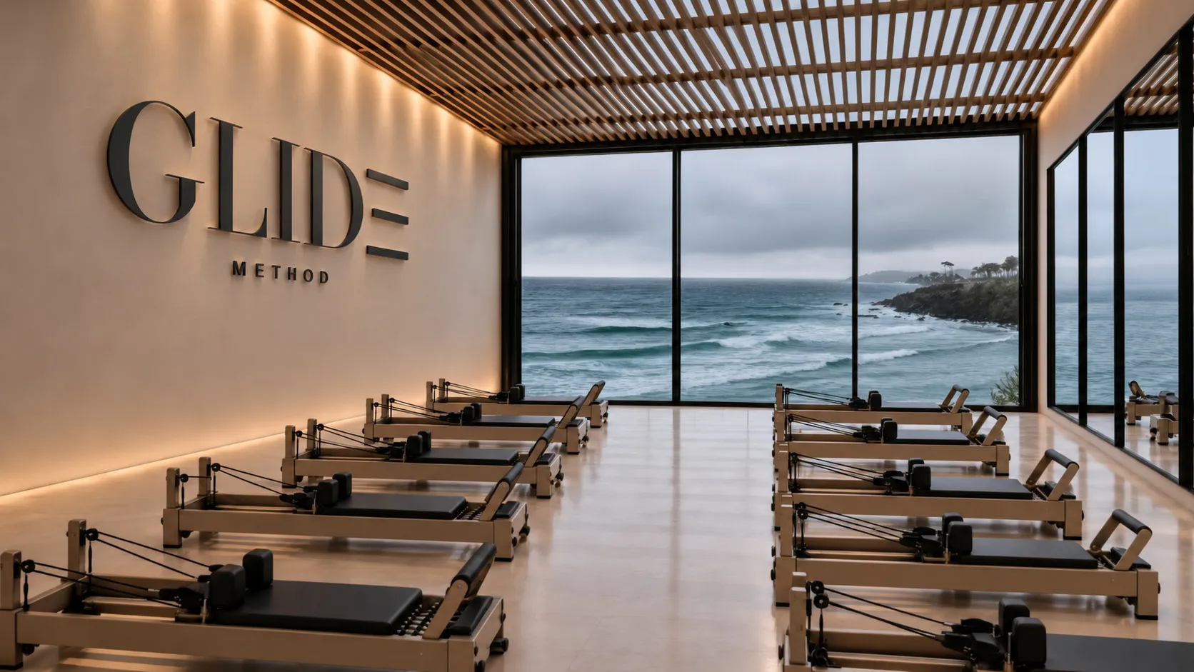
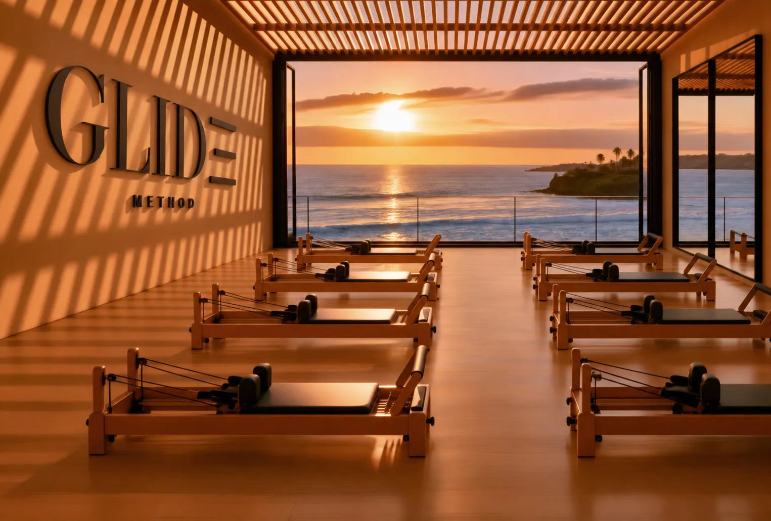
The space became part of the identity. Slatted light, ocean air and a glass wall that opens to the coast shaped a visual system designed to feel calm, precise and physical across the studio, photography and digital experience.
02 / Identity
The three-bar symbol abstracts the reformer itself: two rails and a carriage moving between them. The middle bar sits slightly forward, capturing the reformer mid-stroke. In digital applications, it can slide into place.
How the mark got here
01Ten ways to draw it
Ten wordmarks tested across navigation, app icon and favicon scale before choosing a direction.

02Two ideas, refined
Didone contrast and the movement concept survived. Twelve refinements brought the strongest parts together.


03Measure the carriage
Three middle-bar lengths tested in motion to find the point where displacement felt intentional.
04Build the family
That geometry became a flexible identity family: primary mark, short mark, symbol, app icon and favicon.

Short logo — nav and small spaces

Symbol — the carriage on its own

App icon — salt on sea stone
In written copy, the name is always GLIDE METHOD. The three-bar symbol belongs to the mark, not the word.
03 / Type + color
The type system balances editorial character with everyday clarity: Bodoni Moda defines the mark and expressive moments, Gilda Display carries the headlines, and Hanken Grotesk handles everything functional. A shared neutral palette holds the brand together while each studio introduces its own sense of place.
Bodoni Moda
Logo · hero · italic accents
Strength, slowly.
Gilda Display
Headings · numbers
The room moves with the weather.
Hanken Grotesk
Body · labels · UI
Book a class · 7:00 AM · 4 of 10 left
Core palette · Shared by both studios
Salt
#F4EFE7
Sand
#DCCDB8
Driftwood
#6B6157
Olive
#545A33
Sea stone
#2C3431
Coast accents · La Jolla
Pale stone
#E4DED3
Marine
#A9B5B5
City accents · Little Italy
Espresso
#33241D
Charcoal
#25272A
GLIDE La Jolla
The Coastal Studio
 Book a class
GLIDE Little Italy
The City Studio
 Book a class
One brand, two environments. The shared neutrals stay constant while location-specific accents shift the atmosphere: marine and pale stone for the coast; espresso and charcoal for the city. The system lets each studio feel rooted in its setting without becoming a separate identity.
04 / The place
A permanent glass roof sits above slatted timber, while the ocean-facing glass wall stacks away completely. I built the photography system around changing light and weather, using the architecture itself as a recurring brand device.
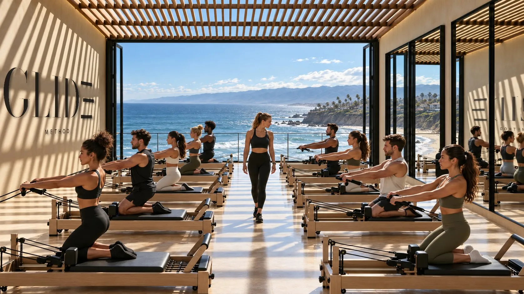
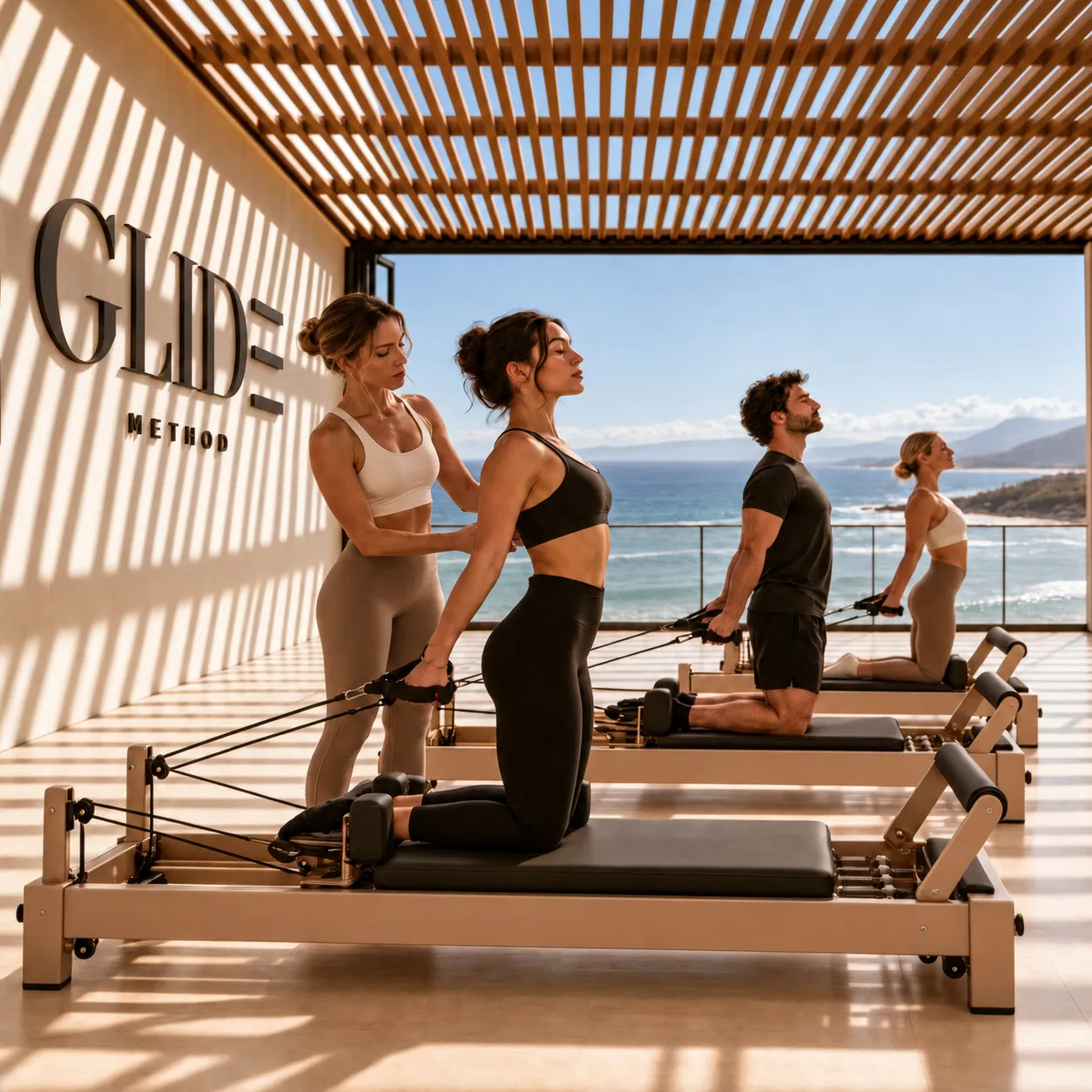
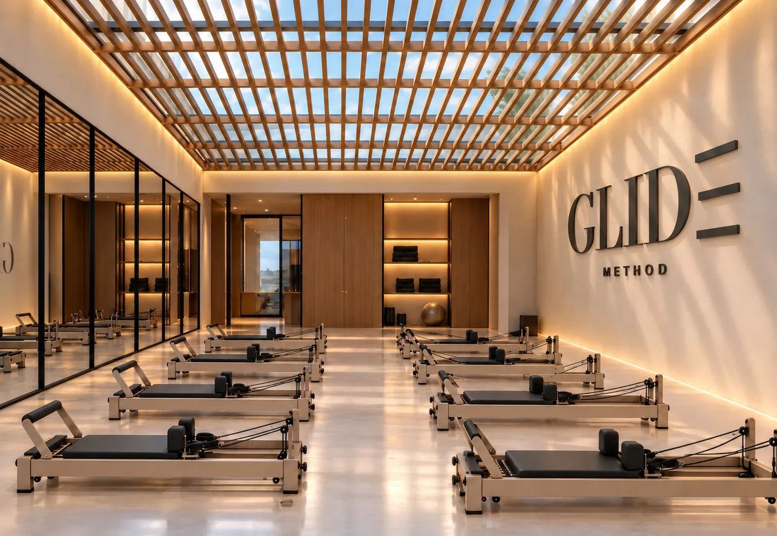
Imagery
AI-assisted concept imagery, art-directed and finished by me. The studio, lighting conditions and brand applications were developed as one visual system.
Drag to turn
05 / The machine
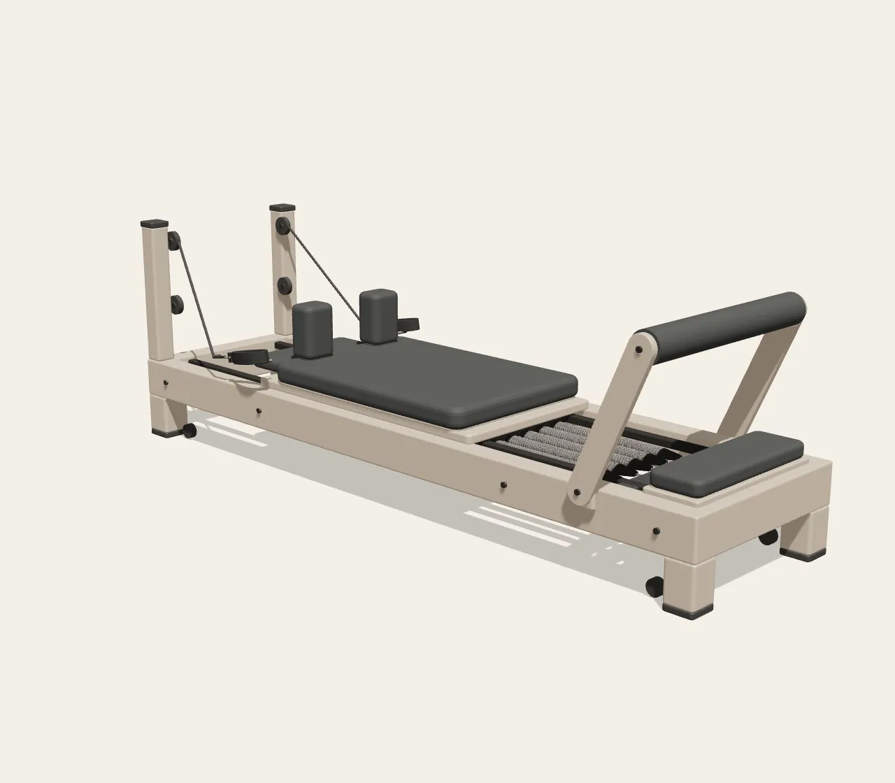
The reformer is central to the experience, so I built it in 3D rather than treating it as a generic equipment image. The model carries the GLIDE material system — sand frame, charcoal upholstery and exposed springs — and gives the digital experience a closer connection to the physical studio.
Custom 3D reformer · built in Three.js · drag to turn
06 / Studio mode
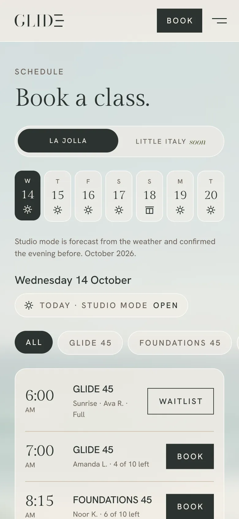
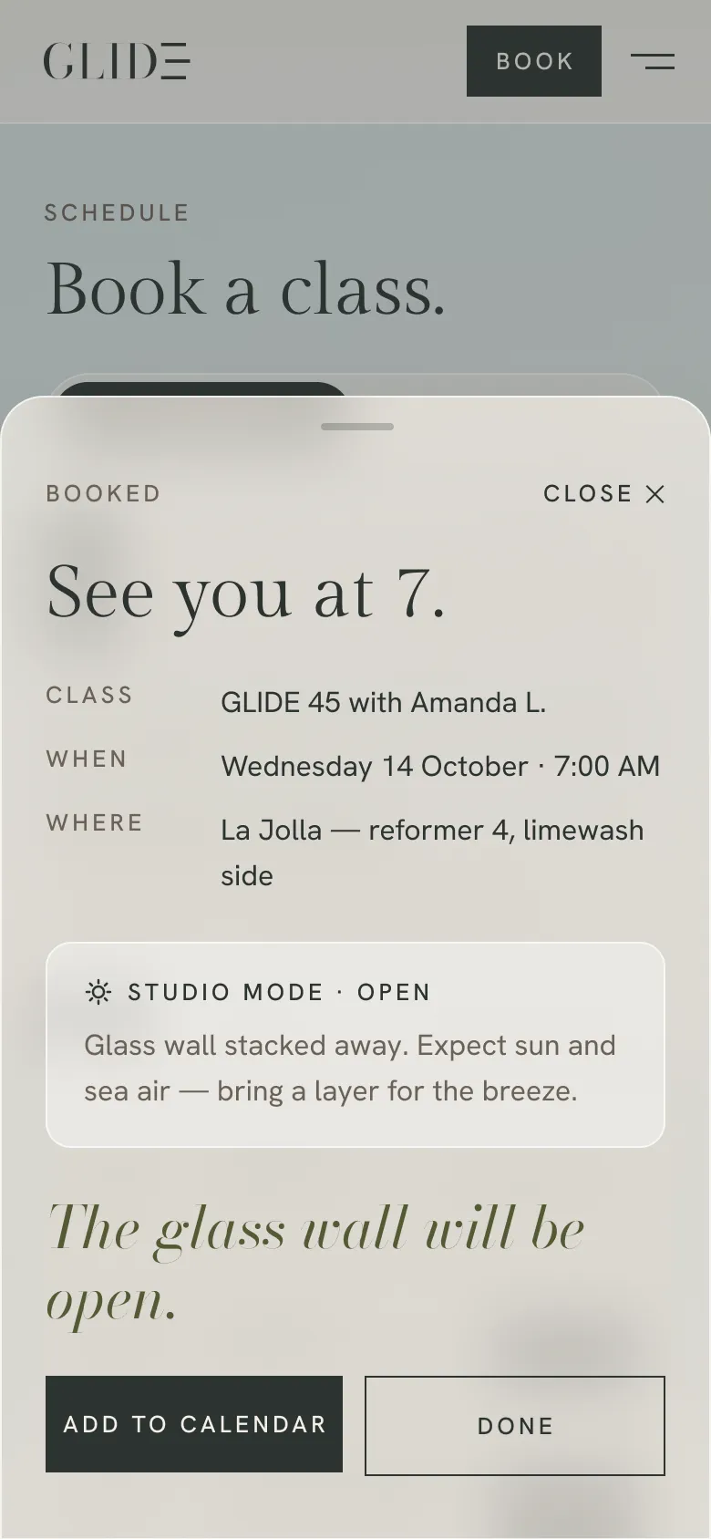
The glass wall changes with the weather, so studio mode became a live piece of information across the experience. From the schedule to booking confirmation to the app, members can see whether the room will be Open or Enclosed before they arrive.
07 / The website
The digital experience carries the same restraint as the studio: editorial type, generous space, full-bleed photography and translucent surfaces that borrow from the room beneath them. The architecture stays foregrounded while the interface keeps booking clear and immediate.
Why glass
Frosted surfaces reference the studio’s glass architecture without competing with it. UI elements sit over photography and light, giving actions structure while letting the environment continue to carry the brand.
Booking-first website
A studio site designed to move quickly from atmosphere to action.
Design process
01Lead with the room
Full-bleed photography comes first. Type and UI stay restrained so the environment can carry the brand.
02Glass over light
Frosted navigation and cards borrow from the studio’s glass architecture, adding structure without covering the photography beneath.
03Choose your reformer
After selecting a class, members choose a specific reformer from the studio map before confirming. The physical room becomes part of the booking experience.
04One build, two studios
Location variables shift photography, color and content for La Jolla and Little Italy without splitting the experience into two separate sites.
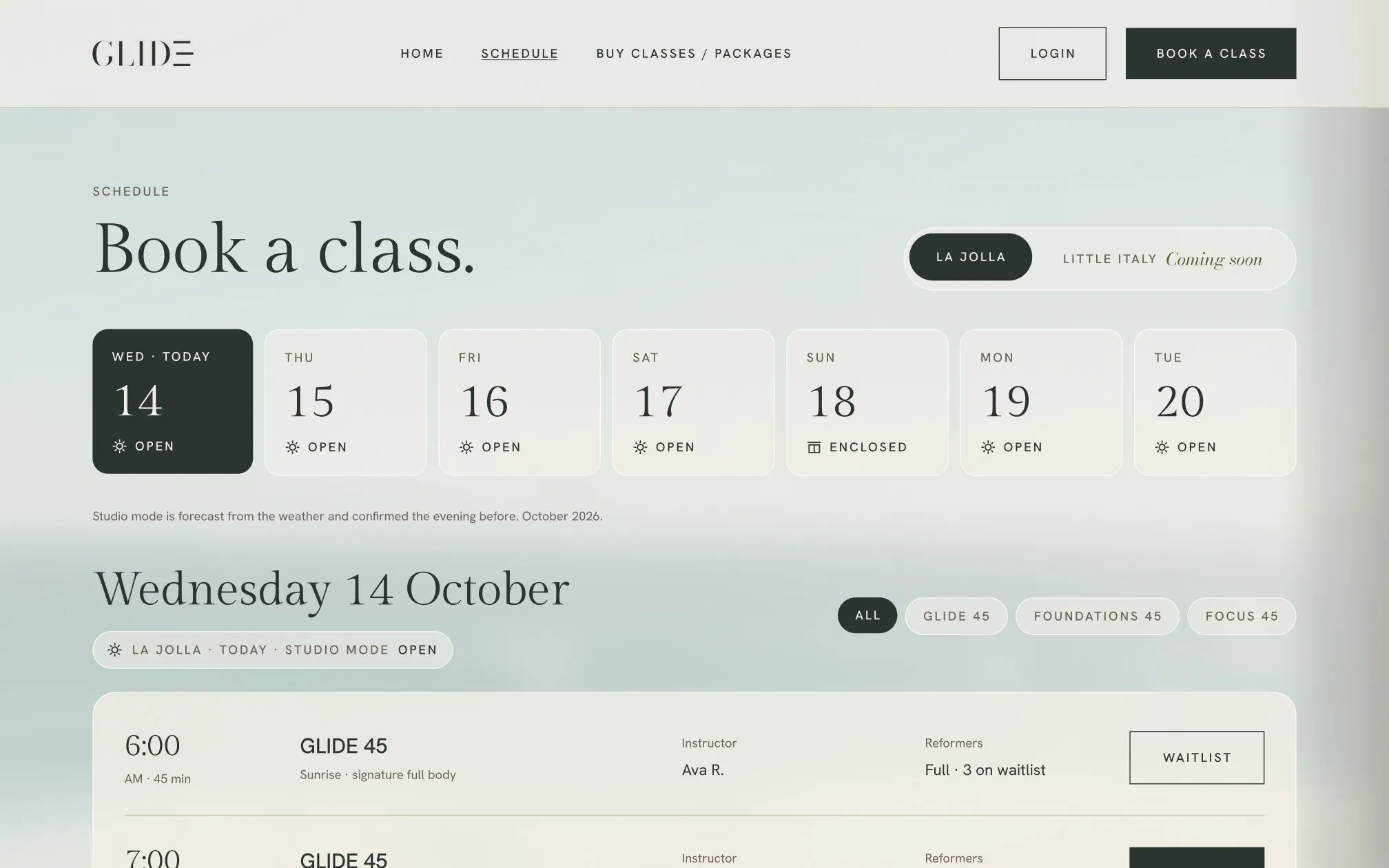
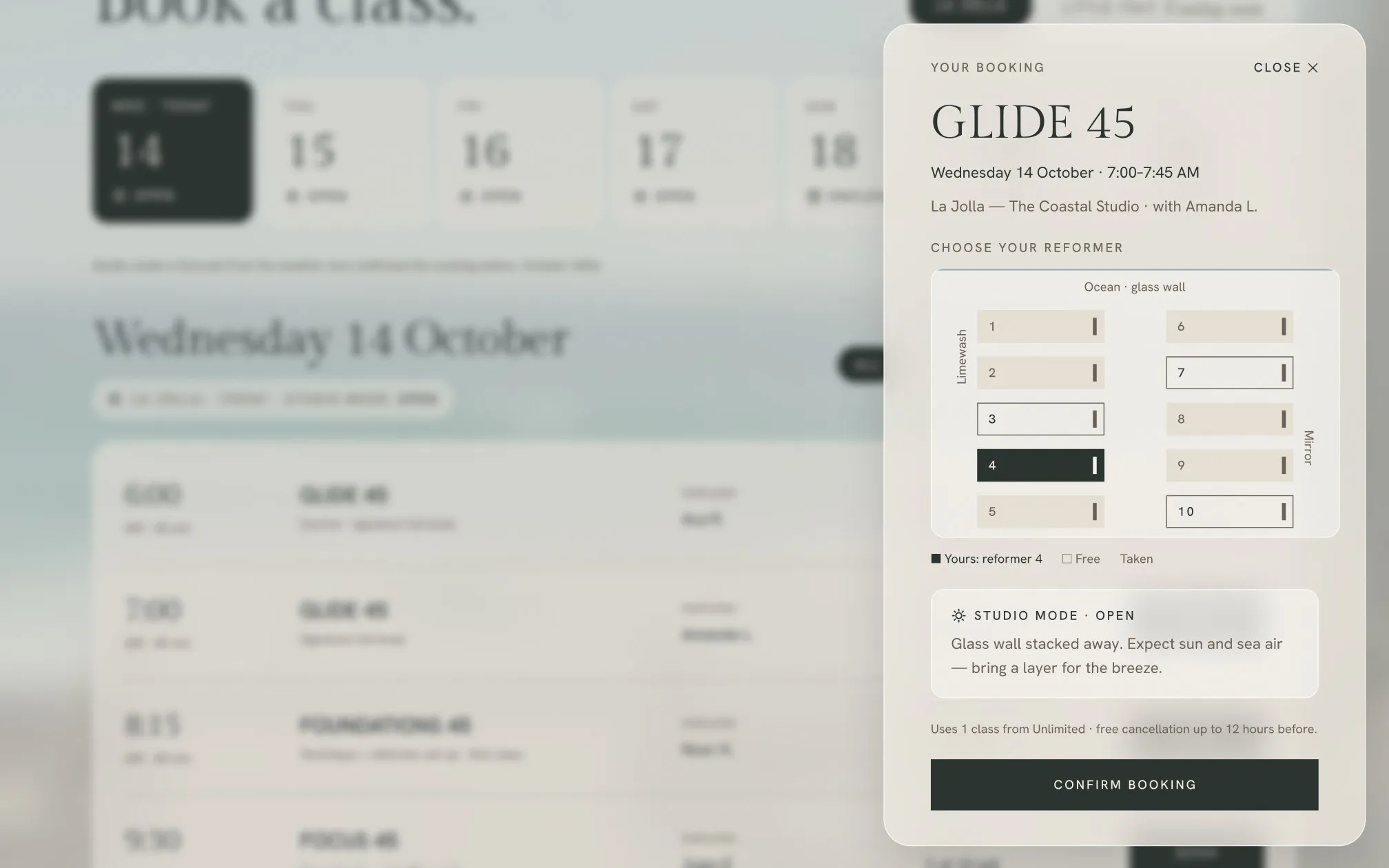
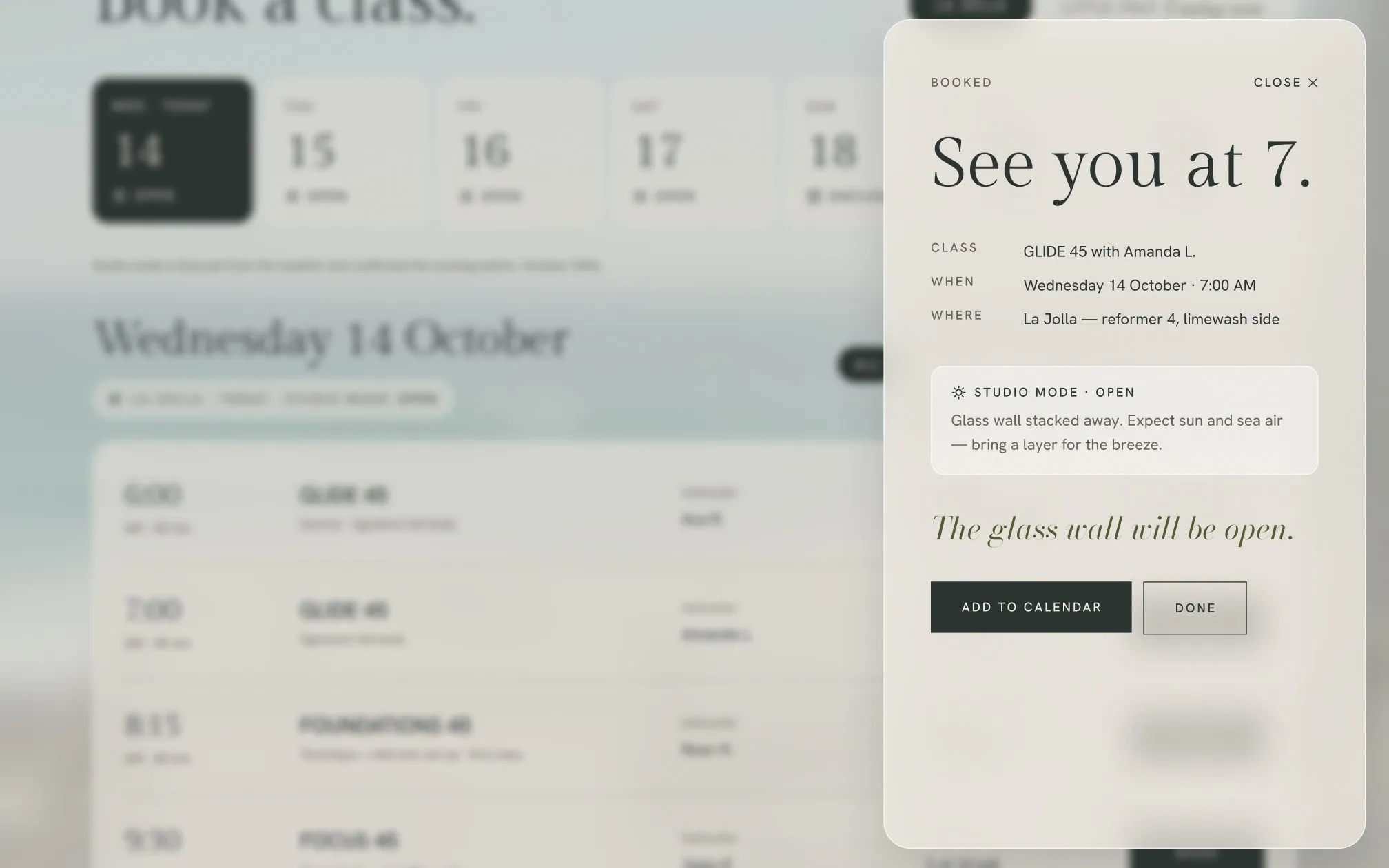
Booking flow · On the website
01 · Pick a class
The week strip shows each day’s studio mode.
02 · Choose your reformer
The studio map lets members choose ocean side, mirror wall or their usual spot.
03 · Booked
Your class, reformer and studio mode are confirmed together.
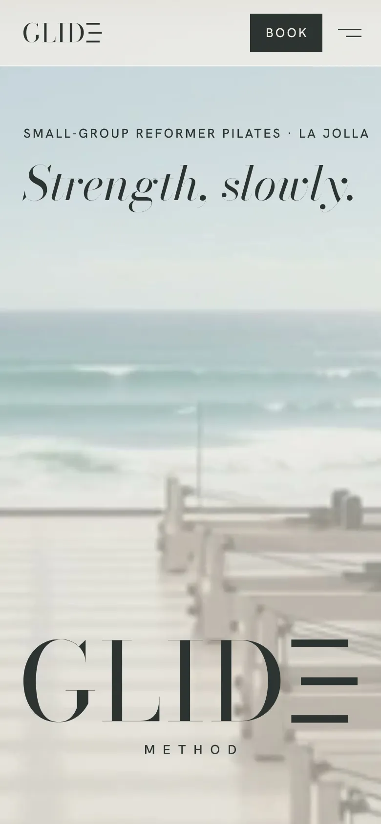
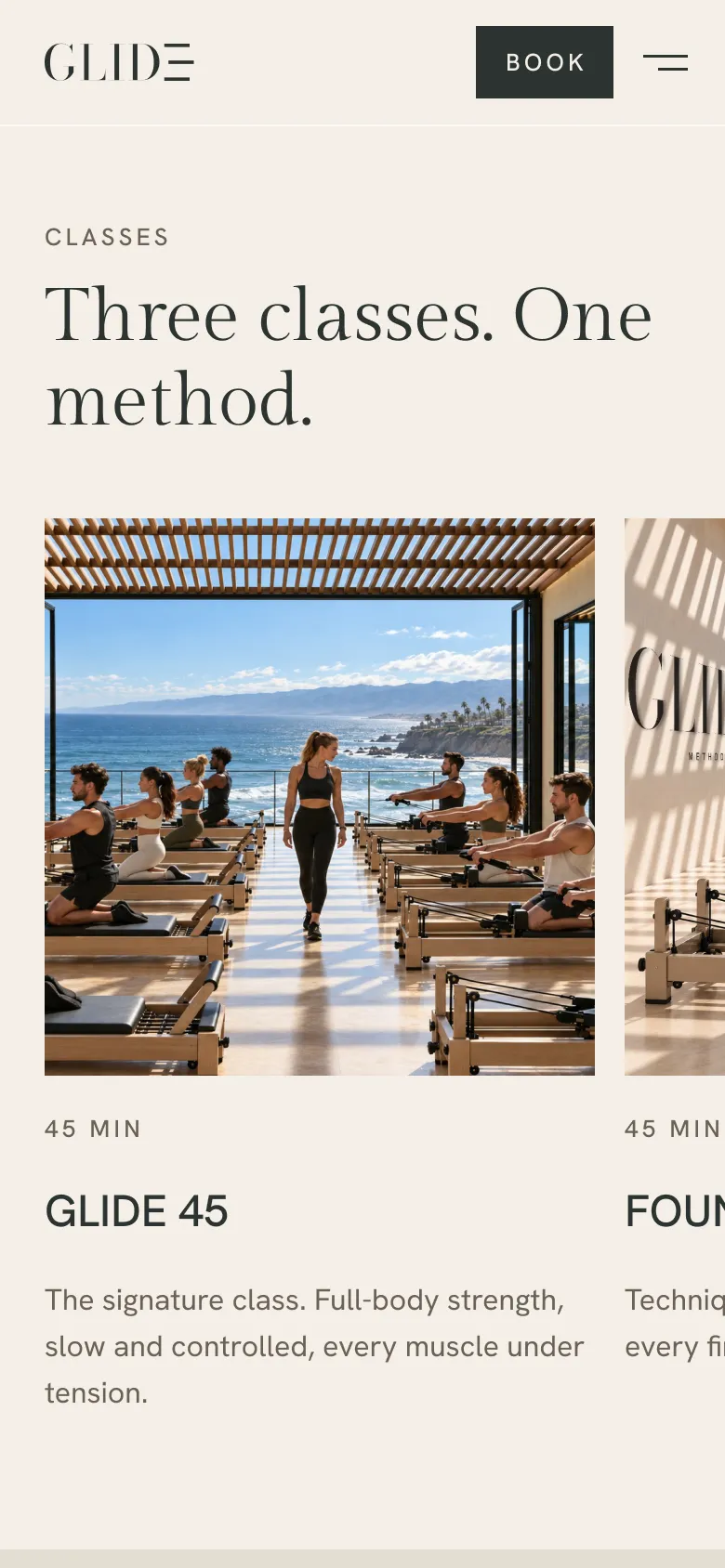
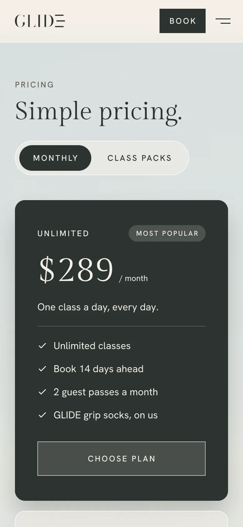
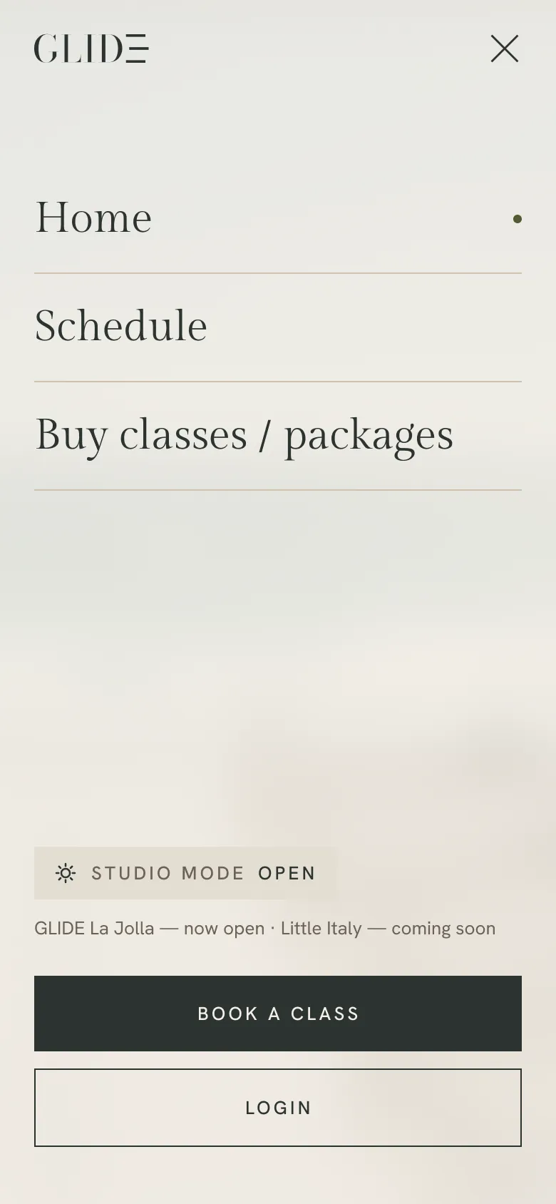
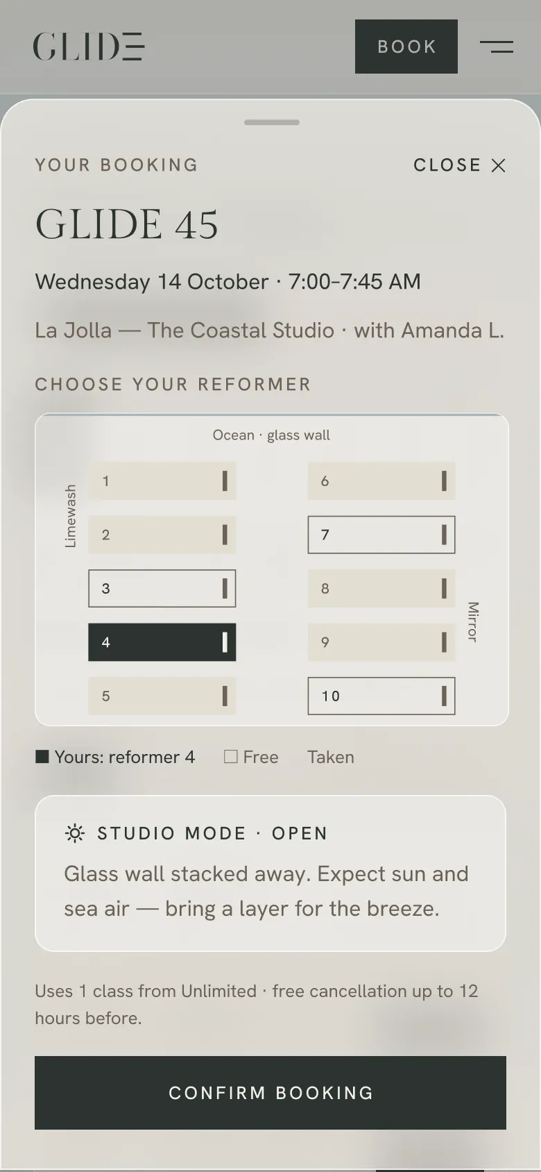
08 / The app
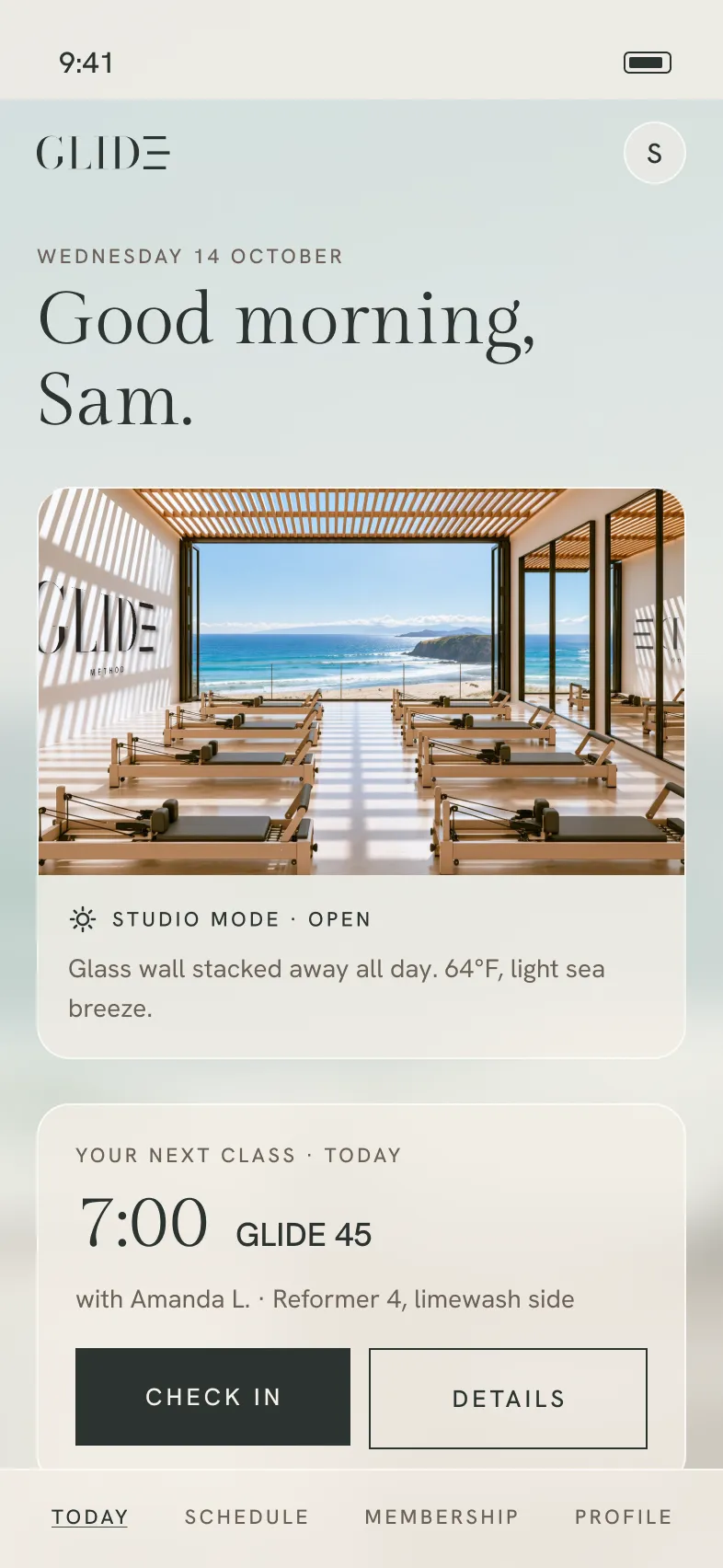
The member app is organized around what matters now: today’s studio mode, the next class, the schedule and membership. Booking stays compact, and every confirmation ends with the same simple promise: “See you at 7.”
Member app
A member utility for today’s class, booking, studio mode and membership.
Design process
01Today first
The home screen leads with the next class and today’s studio mode, so the most useful information is visible immediately.
02From class to confirmed
Choose a class, select a reformer and confirm without leaving the flow.
03Glass, not boxes
The same translucent surfaces carry over from the website, keeping the interface quiet while photography and information stay visible beneath.
04End on a promise
Every confirmation closes the same way: “See you at 7.”
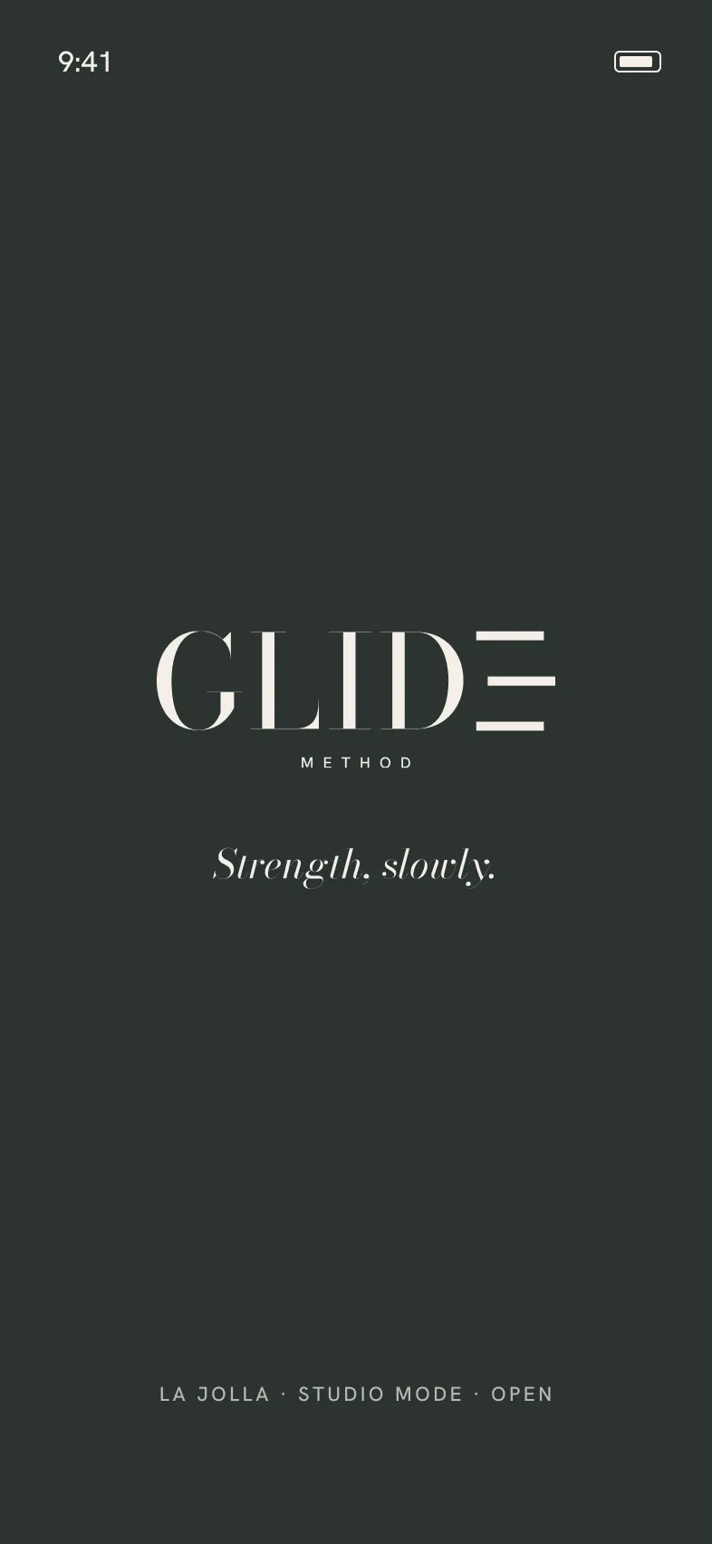
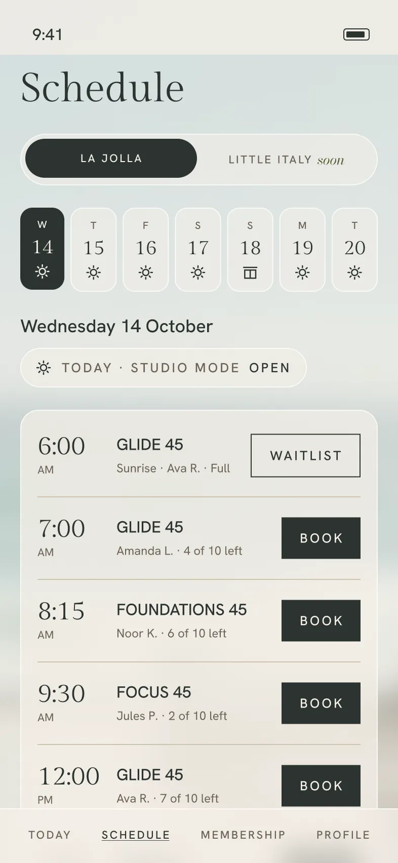
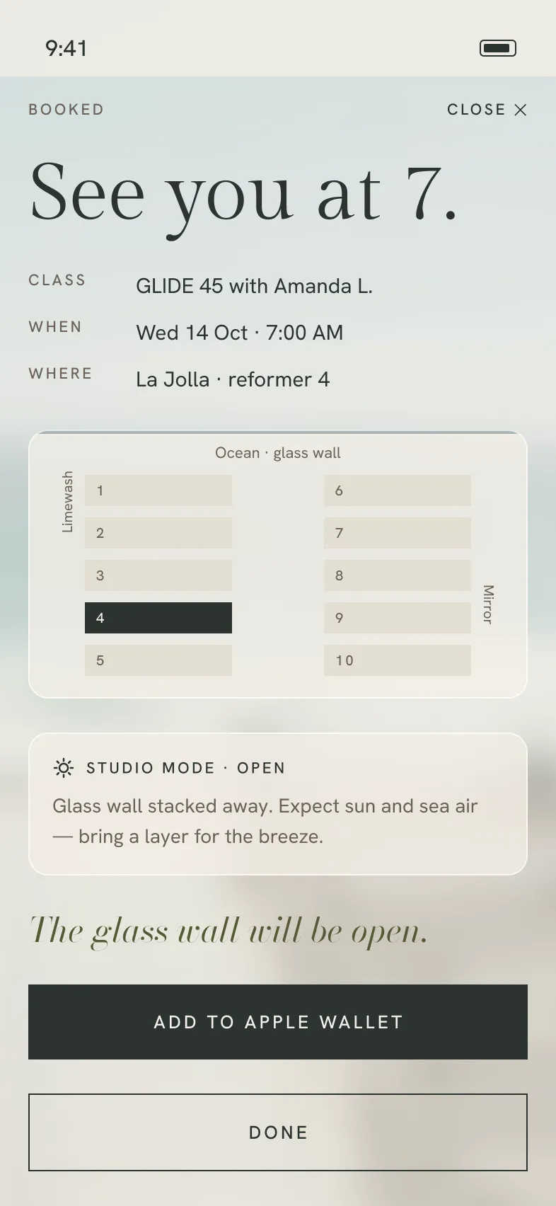
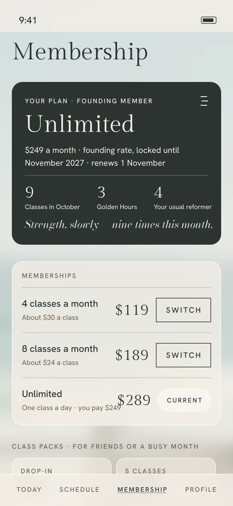
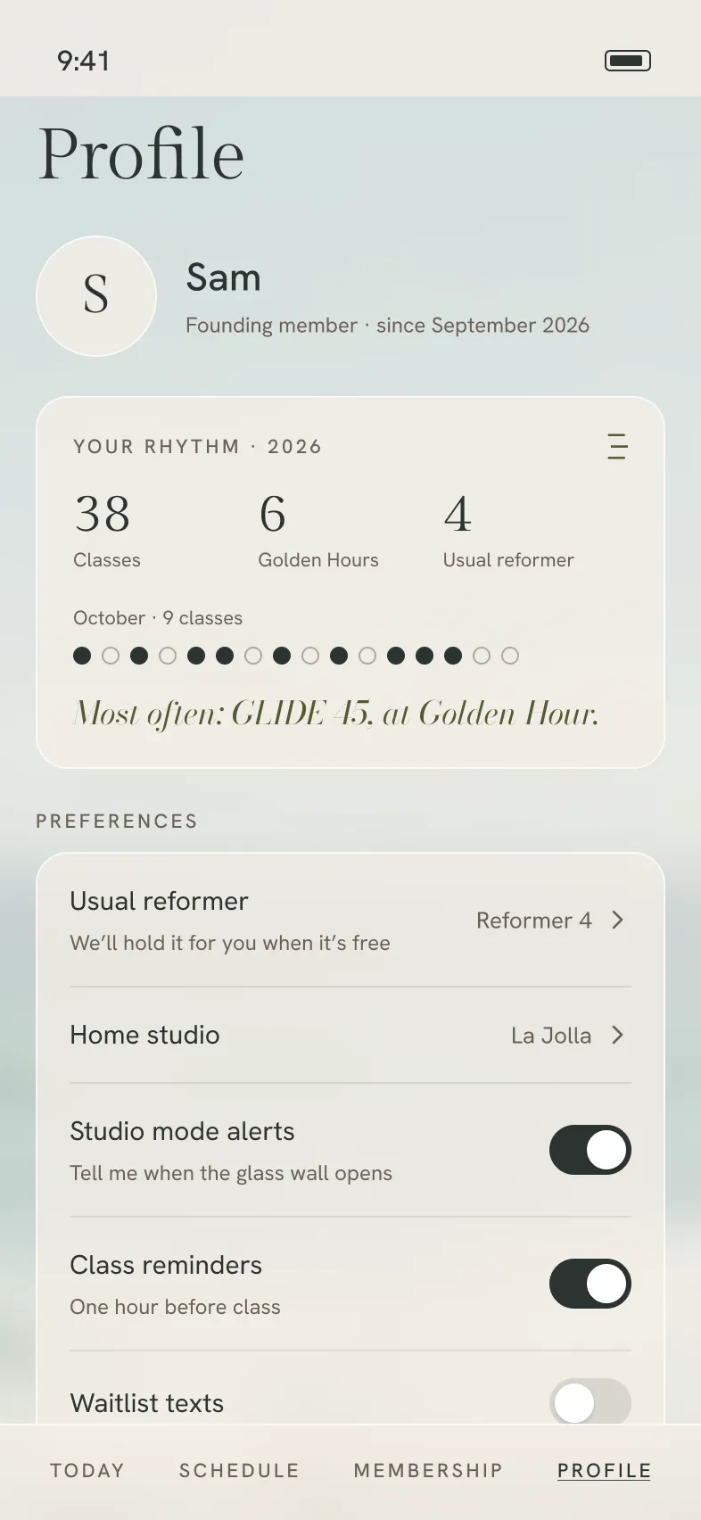
Booking flow · 9-second loop
Today → Schedule → Reformer → Confirmed. The booking flow stays focused on one decision at a time, ending with a specific place in the room and a clear confirmation.
10 / Apparel + objects
The identity extends into the objects members wear, carry and use in class: grip socks, sweatshirts, studio totes, caps and water bottles. Salt, olive and sea stone keep the collection within the core palette, while restrained logo applications give each piece its own expression without leaving the GLIDE system.
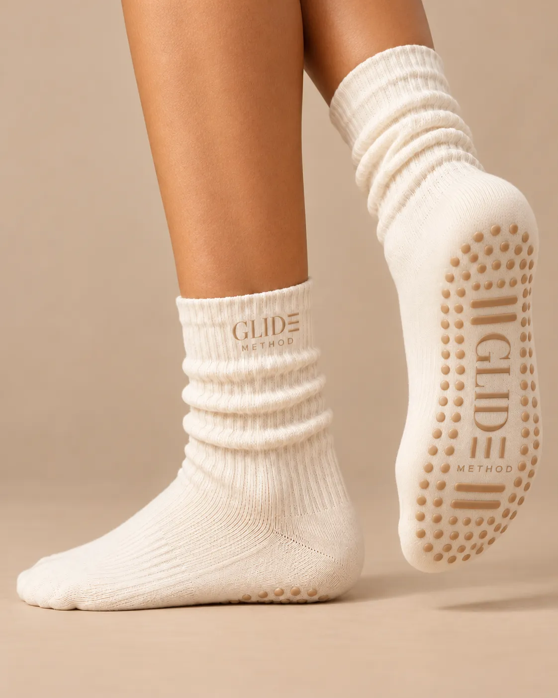
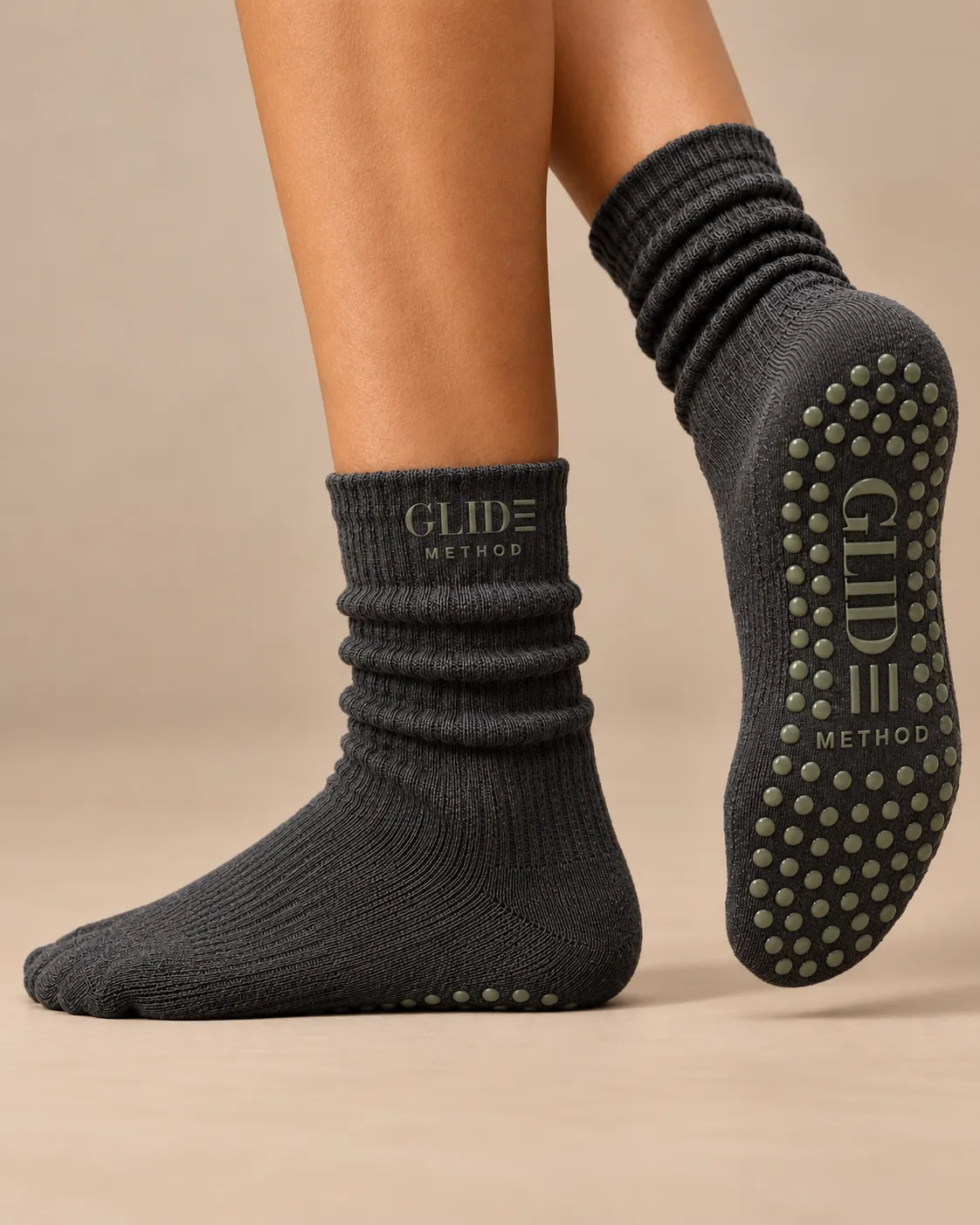
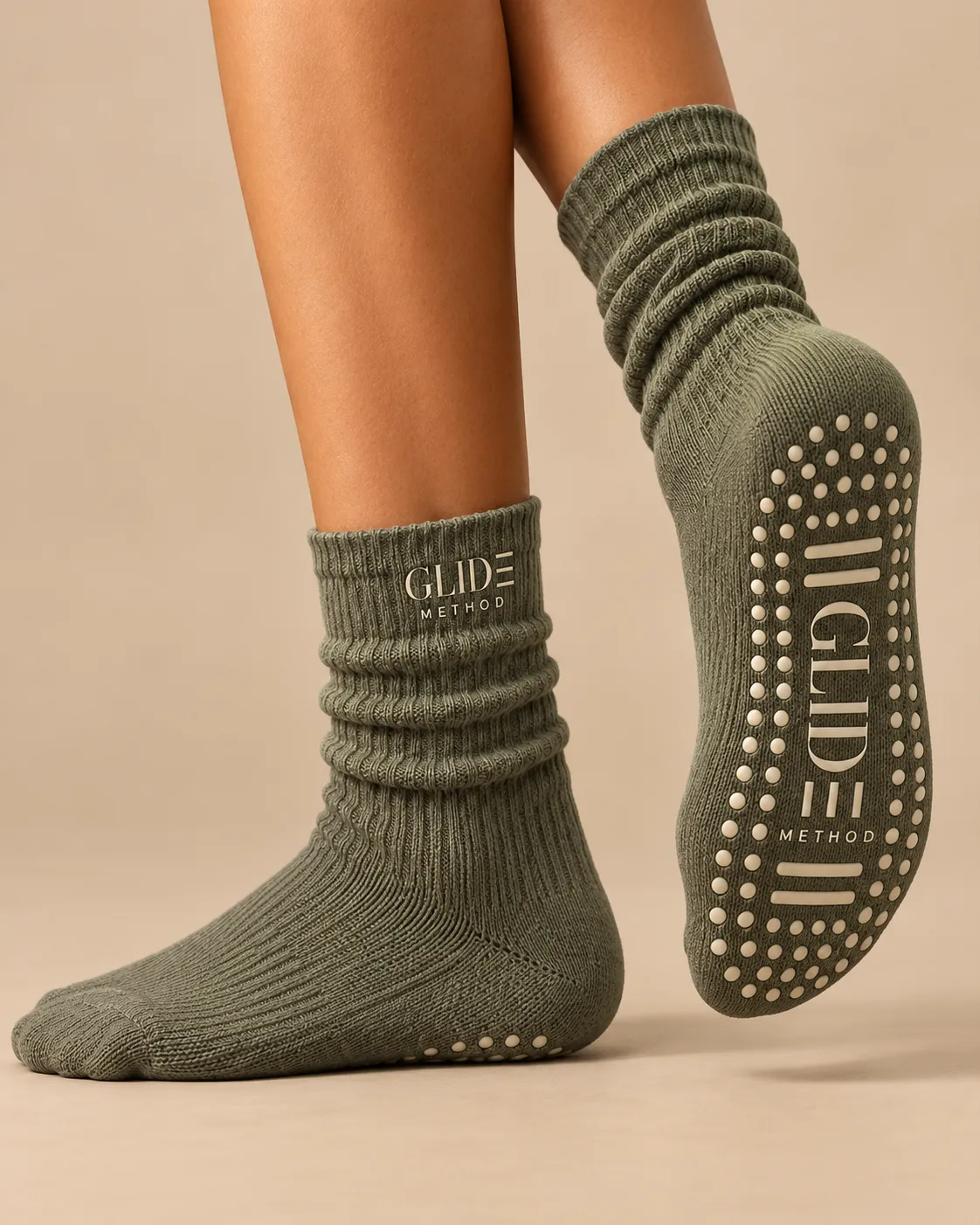
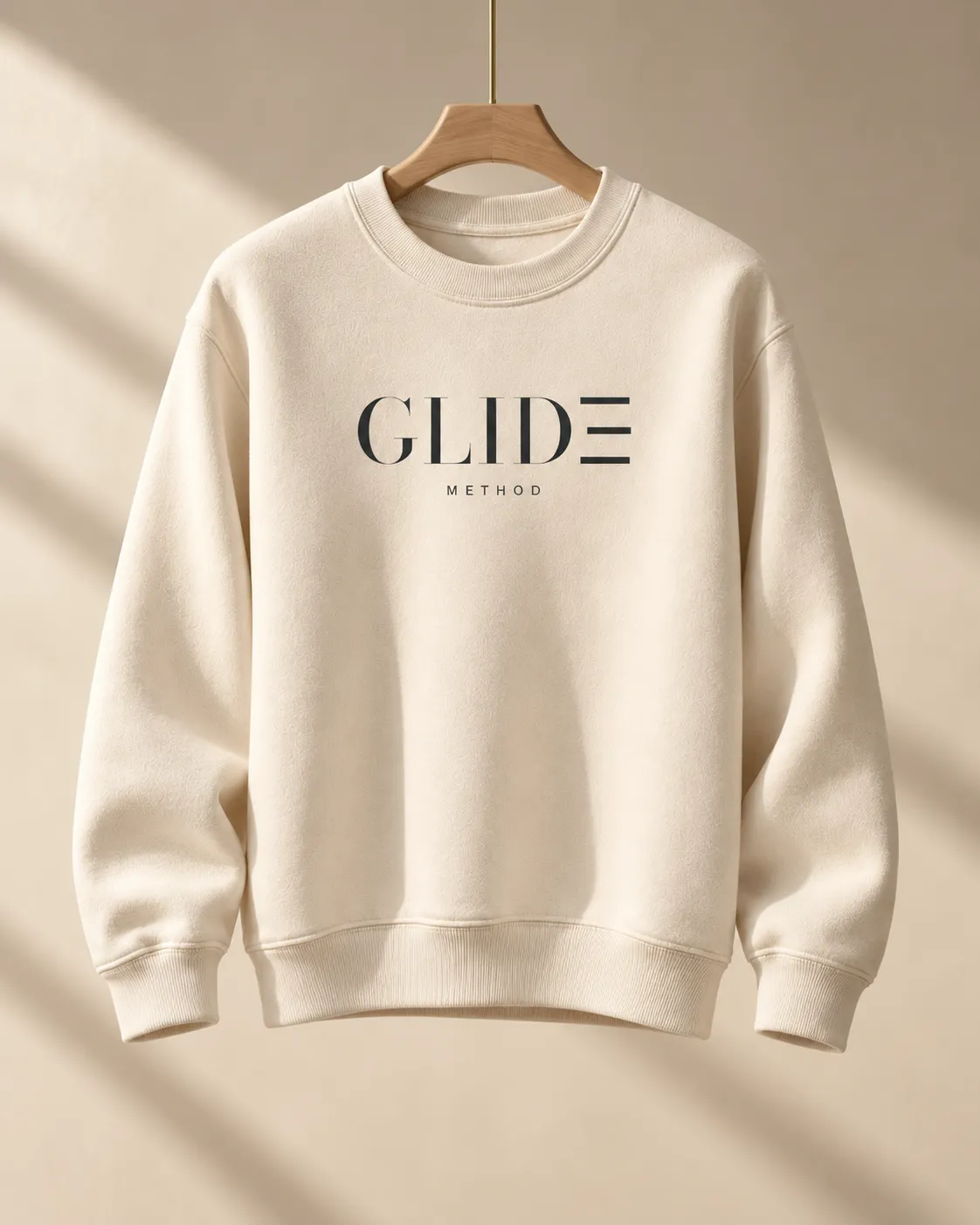
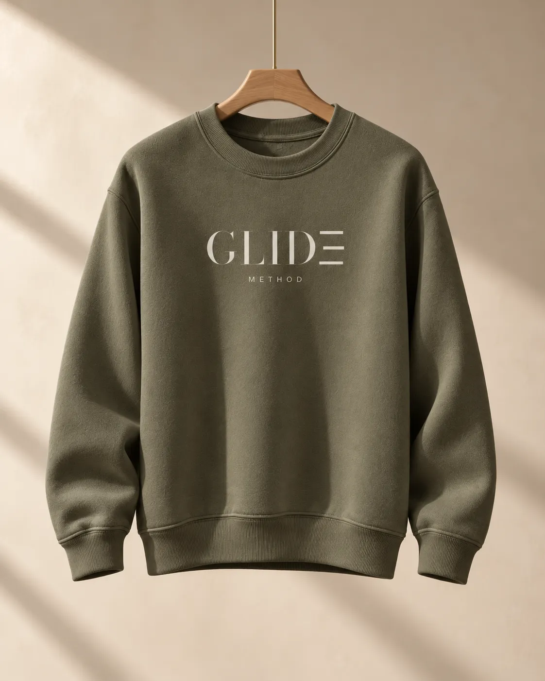
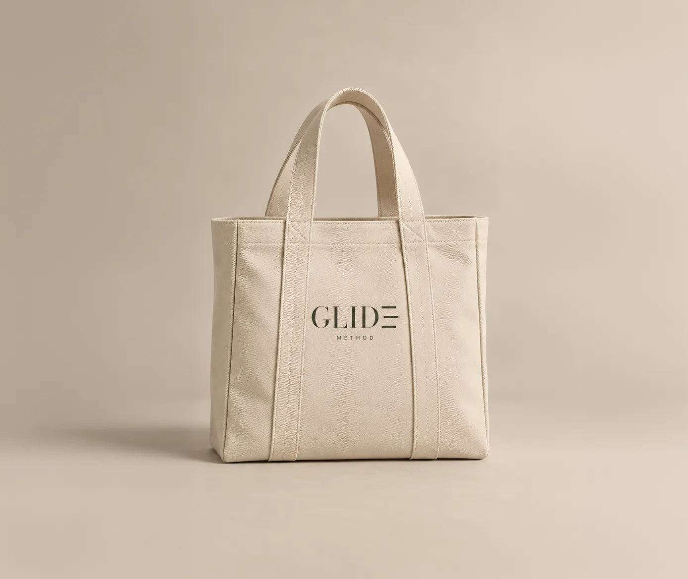
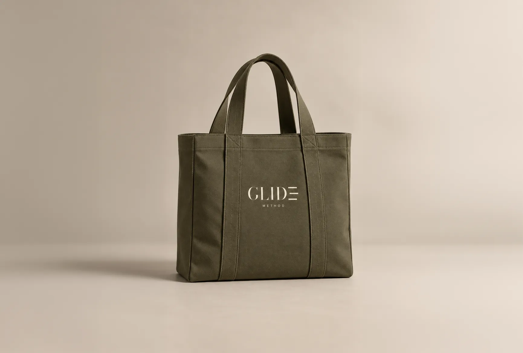
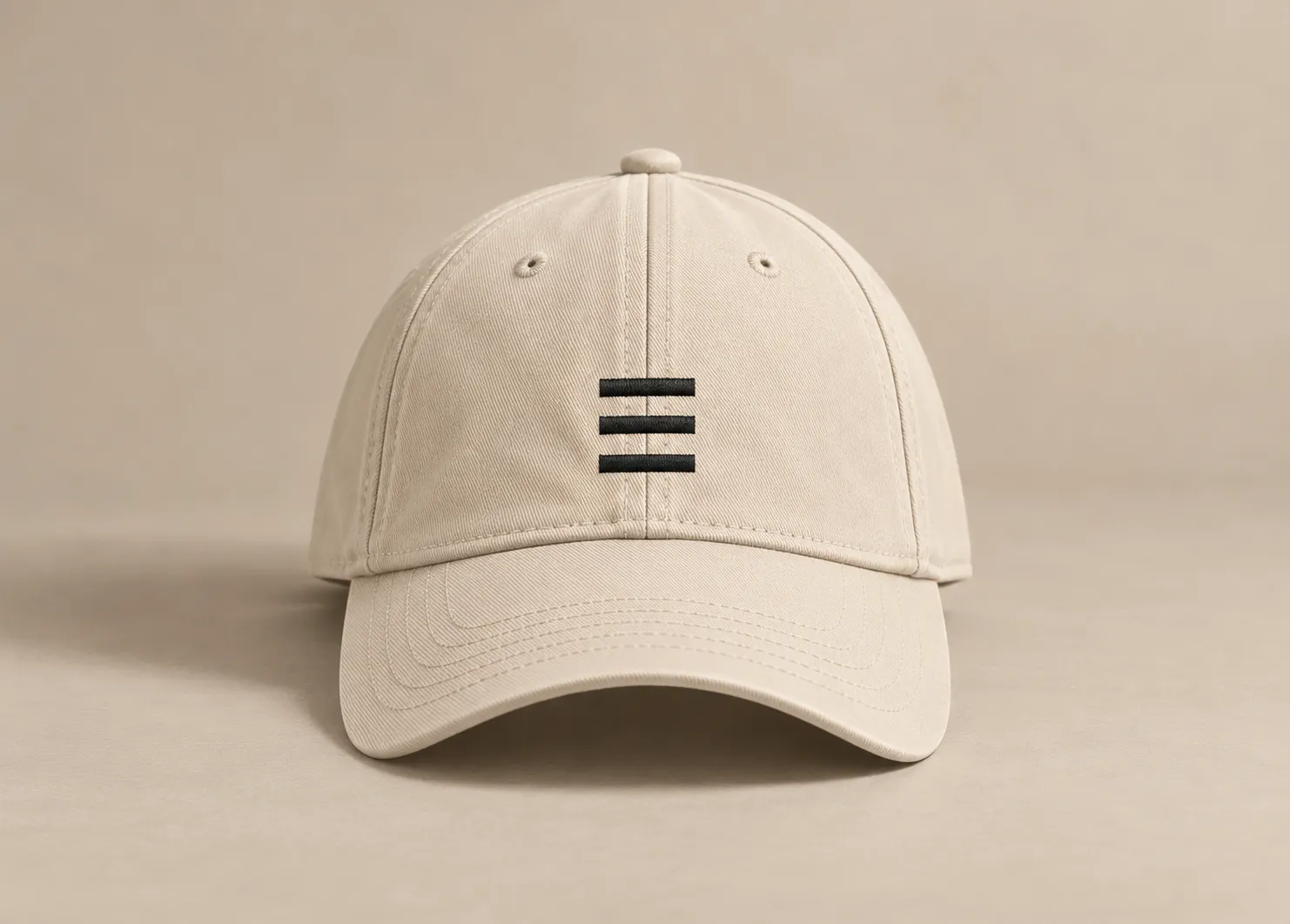
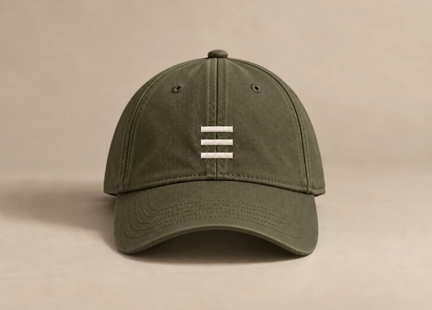
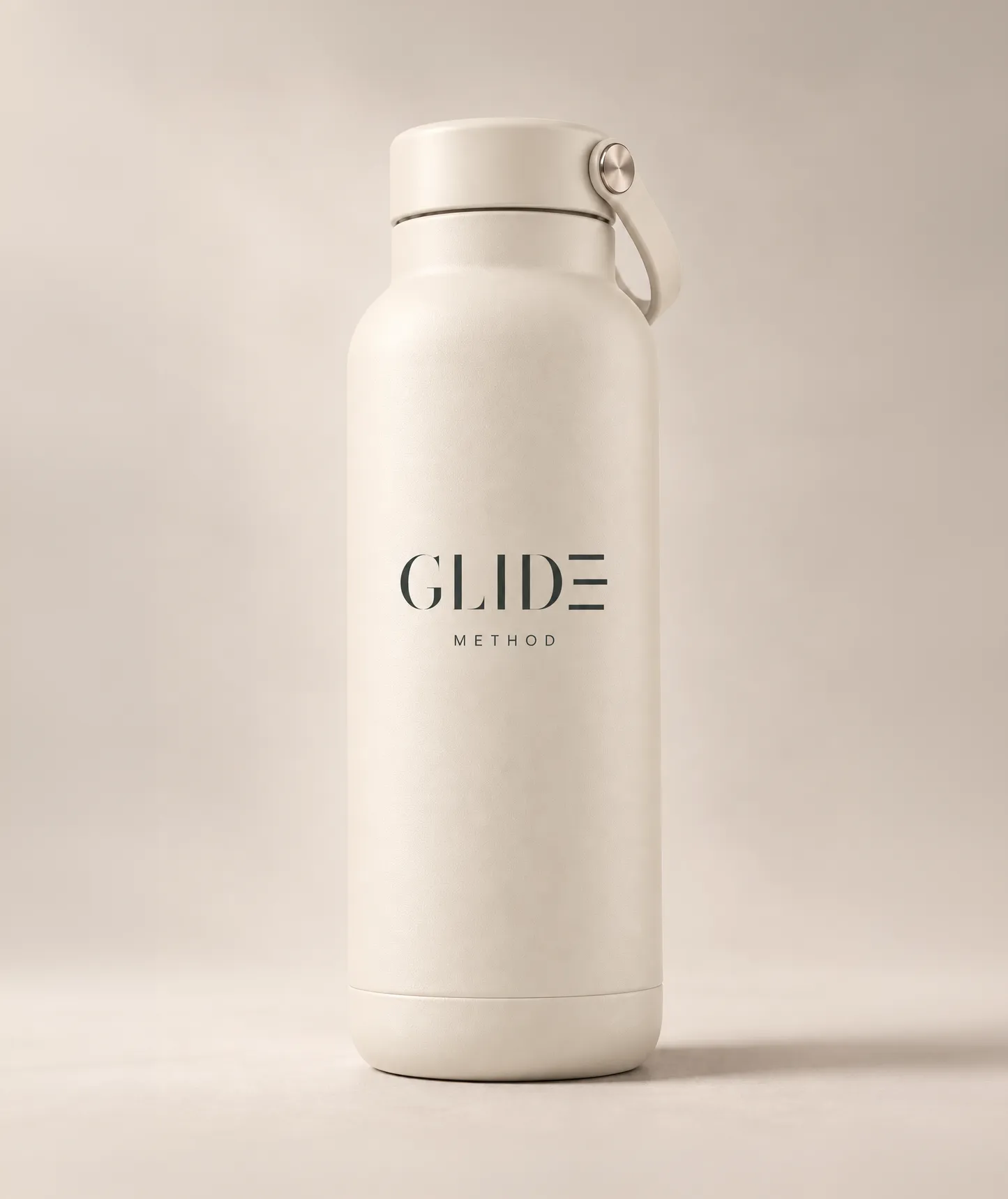
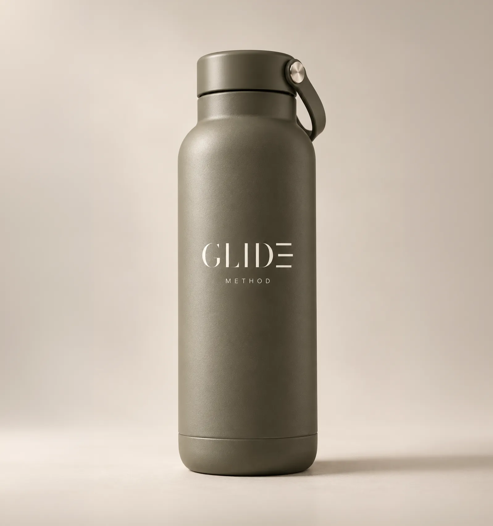
Grip socks · Sweatshirts · Studio totes · Caps · Water bottles
11 / In closing
GLIDE METHOD began with one idea — movement held inside a quiet environment — and carried it across identity, space, imagery, digital experiences, campaign and physical objects. The goal was consistency without repetition: one brand system, expressed differently at every touchpoint.
GLIDE METHOD is a self-initiated concept. The studio, pricing and instructors are fictional, and imagery is AI-assisted unless otherwise noted.



09 / Campaign + social
Four lights, one feed.
The launch grid is built around four recurring states of the studio: Open, Enclosed, Golden Hour and Class in Session. Photography, typography and translucent overlays stay consistent, while changes in light, weather and movement give each post its own atmosphere.
1080 × 1350 (4:5) · 9 launch posts · one visual system
Launch ads · Meta
Same brand, paid to perform.
Paid social carries the same editorial system into more direct, conversion-focused messages: one idea, one action and a clear reason to book. The launch mix moves from introduction and small-group proof to first-class education, founding membership and retargeting — all built for feed and Stories/Reels without changing the visual language.
03 · Carousel — Your first GLIDE 45 · Place → Instruction → Method → Payoff
Concept ads. A live campaign would use staged class footage art-directed to these same frames.