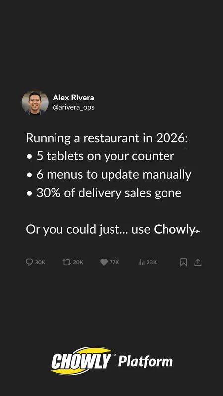
Real-world work  ·  B2B SaaS  ·  Sole graphic designer, Marketing

Chowly

From high-volume marketing design to shaping the brand across web, campaigns and events.

B2B SaaS  ·  Brand  ·  Web  ·  Campaign  ·  Print  ·  Systems  ·  2024–2026

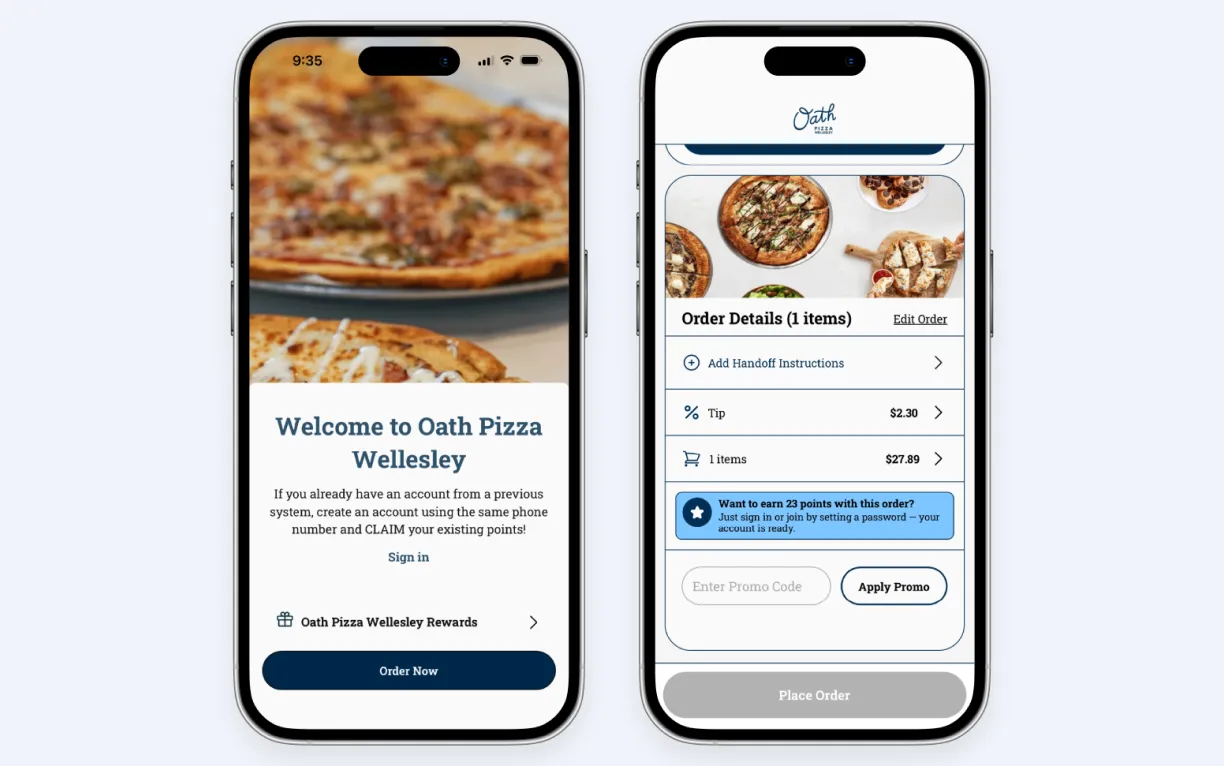
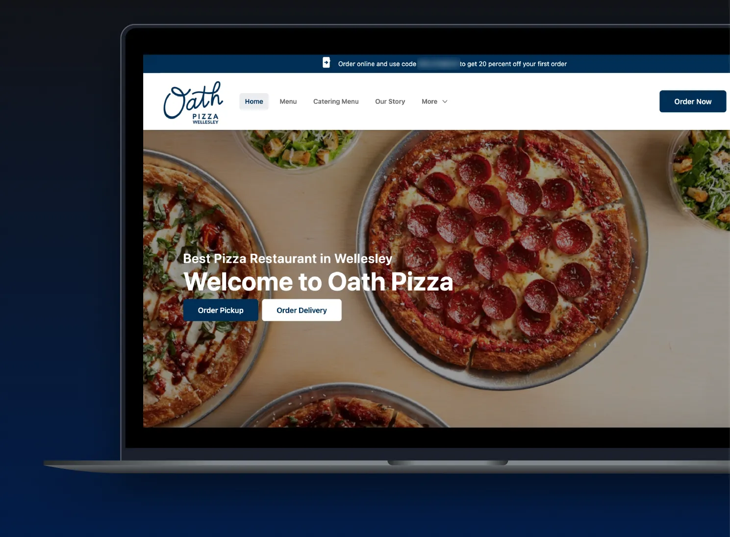
The Oath Pizza website, built on Chowly, on a laptop
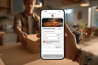
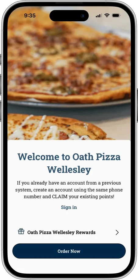
The Oath Pizza ordering app on a phone
Oath Pizza — website and app, both on Chowly. Real customer, real screens.

The company

Chowly helps independent restaurants take orders directly instead of paying delivery-app commissions. Teams across the company needed creative for different audiences, channels and timelines — and as volume grew, the challenge was keeping the brand clear across every touchpoint.


My role

I was the sole dedicated graphic designer on Chowly’s Marketing team throughout my time there — on contract from 2024, full-time from April 2026 — owning the visual work and, increasingly, the structure behind it: guidelines, templates and documentation that kept teams and partners moving. Worked with marketing, customer success and outside agencies.

Figma  ·  Adobe CC  ·  Firefly  ·  AI image tools  ·  Claude Code  ·  Canva

01  /  How it grew

It started with assets. It grew into the brand.

My role at Chowly grew from high-volume marketing design to shaping the brand across web, campaigns, events and customer-facing creative. I was Chowly’s sole dedicated Graphic Designer for Marketing, creating the work while also building the guidelines, templates and workflows that kept it consistent.

02  /  Brand system

One brand, built to work everywhere.

Chowly’s identity had to hold together from a website header to a trade-show wall. I didn’t reinvent it — I organized it into a practical system: clearer logo rules, a palette simplified from 24 colors to 7, one type pairing, a brand guide agencies could actually use, and a QA’d library of 66 logo files for teams, vendors and partners.

Logo by Chowly; system, guide and rollout by me.

01  LOGO

The Chowly Platform wordmark on a pale groundThe Chowly Platform wordmark reversed on navy

One primary wordmark, four color variants, clear-space and size rules.

02  COLOR

  • Navy

  • Brand Blue

  • Accent

  • Yellow

Simplified from 24 colors to 7: 4 brand + 3 neutrals. Yellow earns attention — CTAs and one or two words, never more.

03  TYPOGRAPHY

Lato

Inter

Lato leads. Inter reads. One pairing covers every surface.

Explore the full brand guide  →

Opens the web edition — a subpage with every rule and the reasoning behind it.

03  /  Website

Designed in Figma. Shipped in code.

The website was where my role grew most. I designed and refined marketing pages in Figma, moved components onto design tokens, wrote the Designer Guide that maps components to code, polished pages across desktop, tablet and mobile for launch, and added the product-page heroes to the live site myself. Engineering owned the platform and migration.

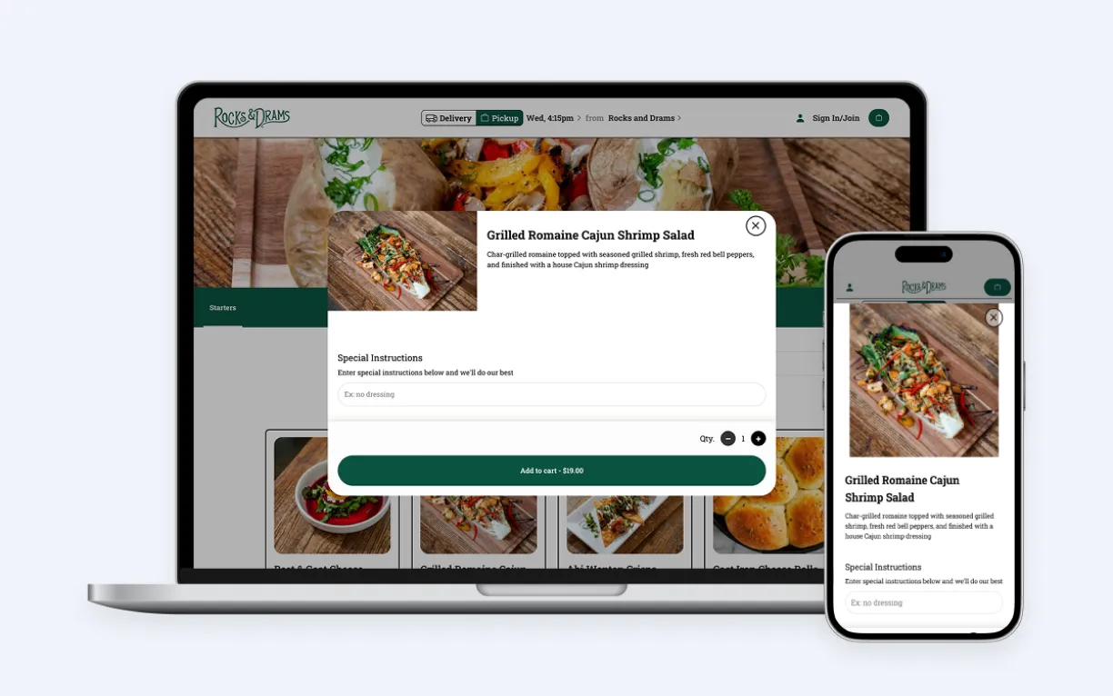
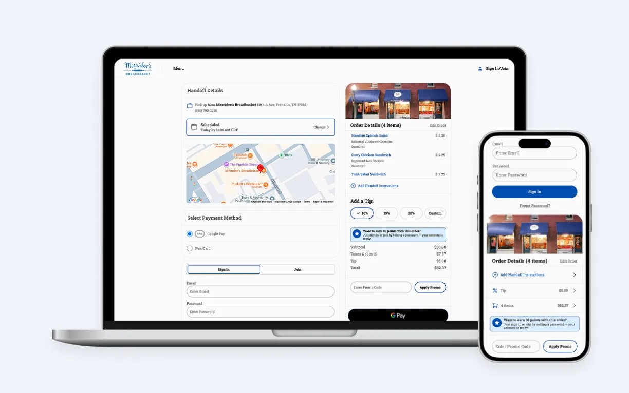
  • Chowly online ordering product hero: a restaurant ordering site on laptop and phone

    Online ordering

  • Chowly loyalty product hero

    Loyalty

  • Chowly mobile app product hero: two phones

    Mobile app

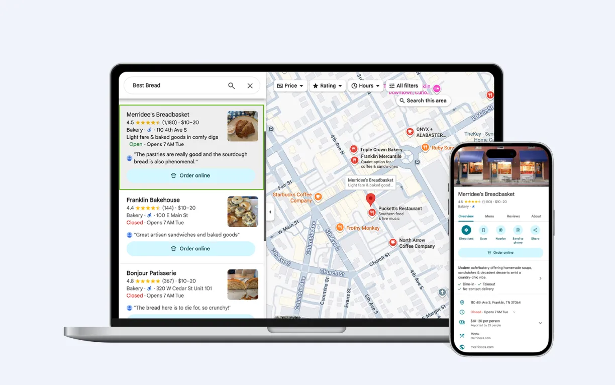
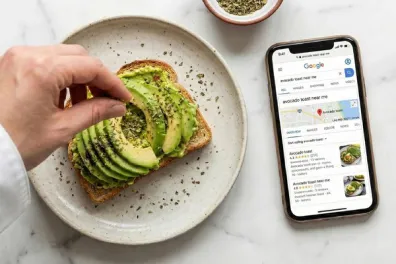
  • Chowly Google Business product hero

    Google Business

Case study page — designed + built

From one page to a repeatable system.

Customer stories needed a repeatable path from interview to published page. I designed the page template and built the copy brief, build checklist and template rules around it — then took the first story, Pete’s New Haven Style Apizza, from Figma to code myself with Claude Code, Git and GitHub: my first full design-to-build page.

Interview and story copy by Chowly’s content agency; template, design and build by me.

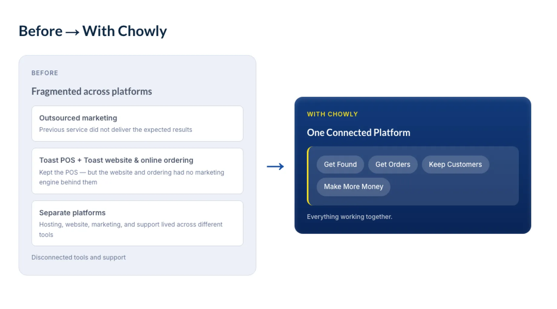
The Before → With Chowly section: fragmented systems on the left, one connected platform on the right
Before → With Chowly — the template’s signature section

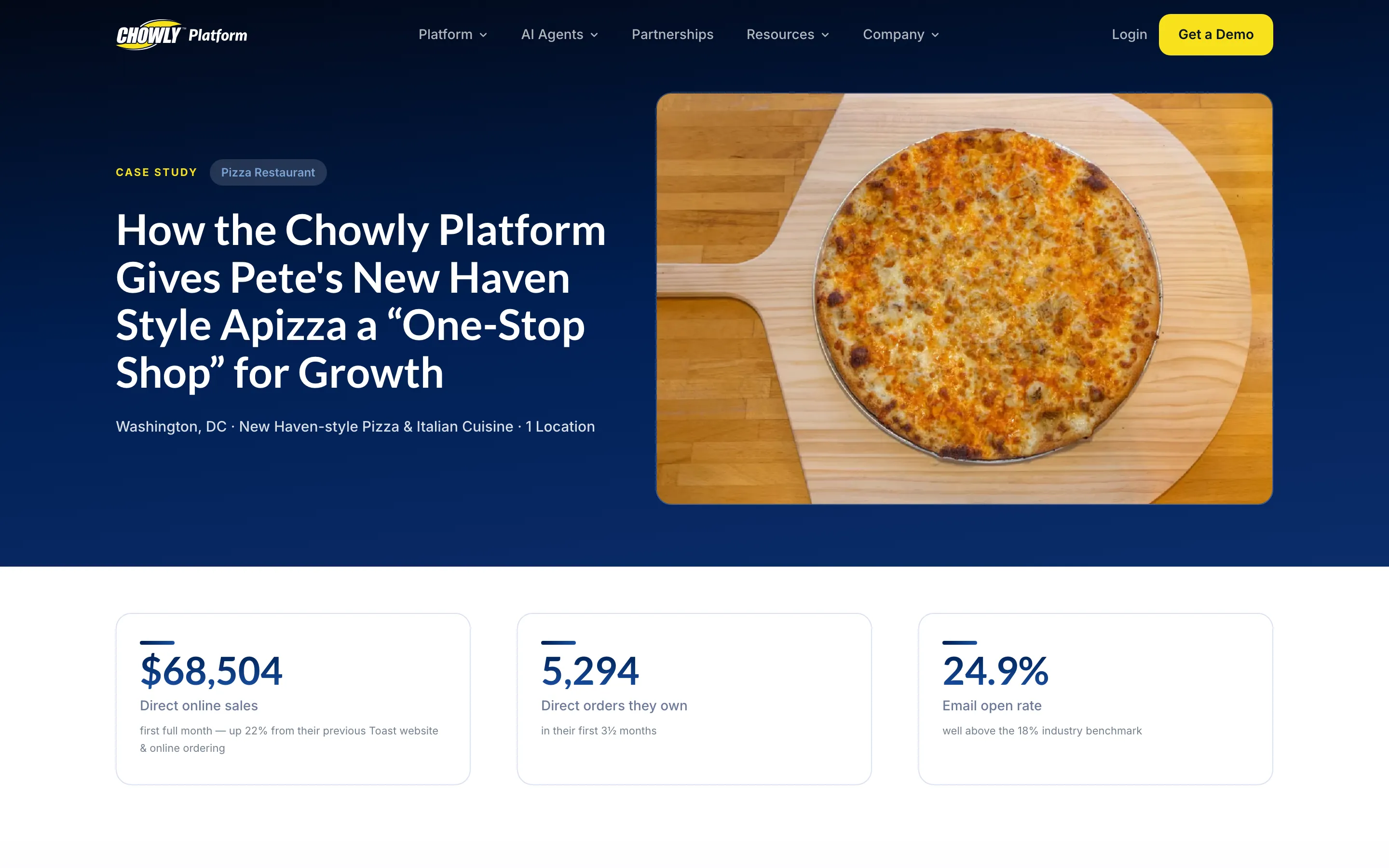
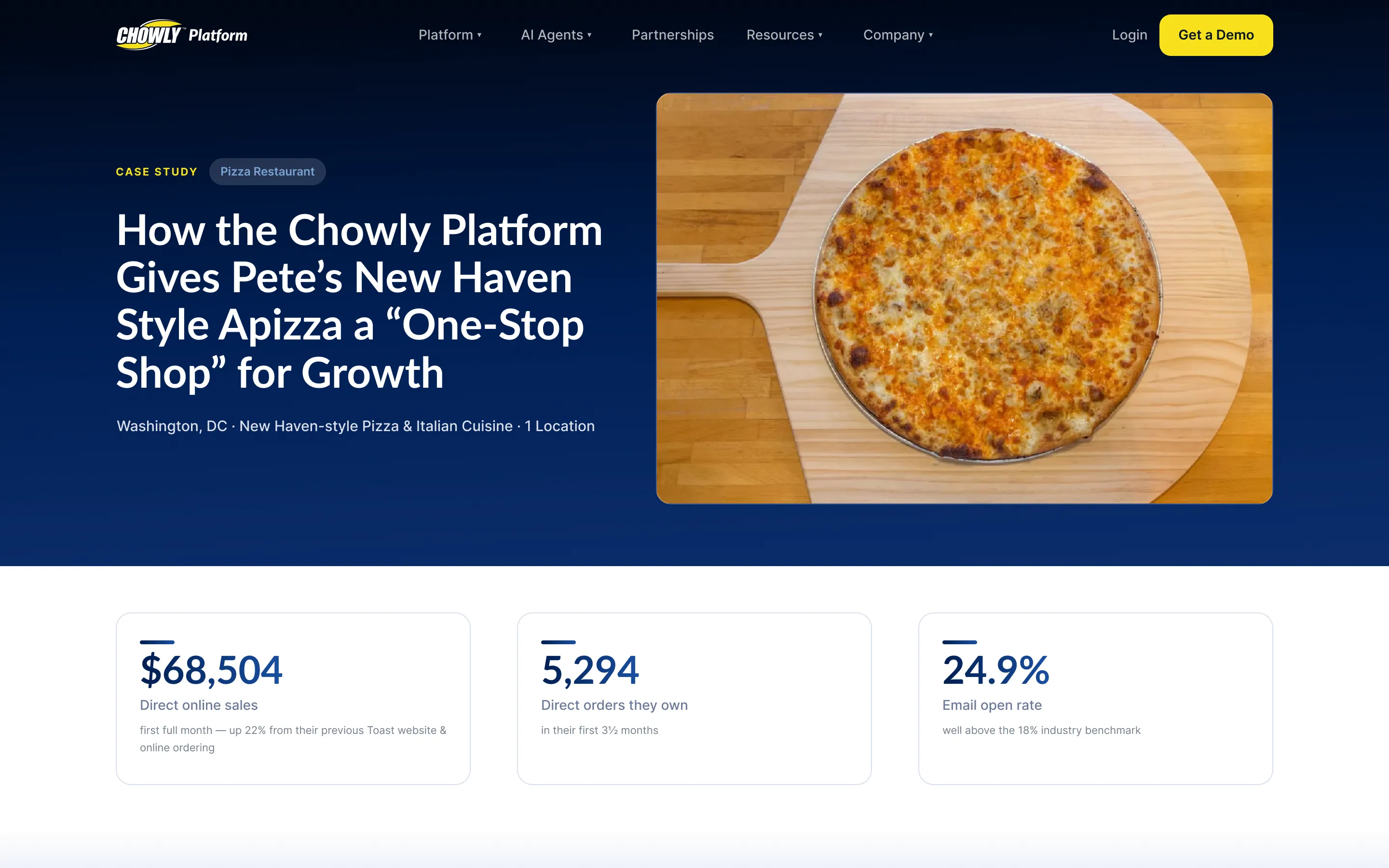
Figma → live

The template I designed in Figma, side by side with the live page I built. Drag to compare.

Pete’s case-study page live on chowly.com
Pete’s case-study page as designed in Figma

Figma side rebuilt for this portfolio from my template (the original file stayed with Chowly); right side is the live page on chowly.com.

Template anatomy

What stays the same, and what each story fills in.

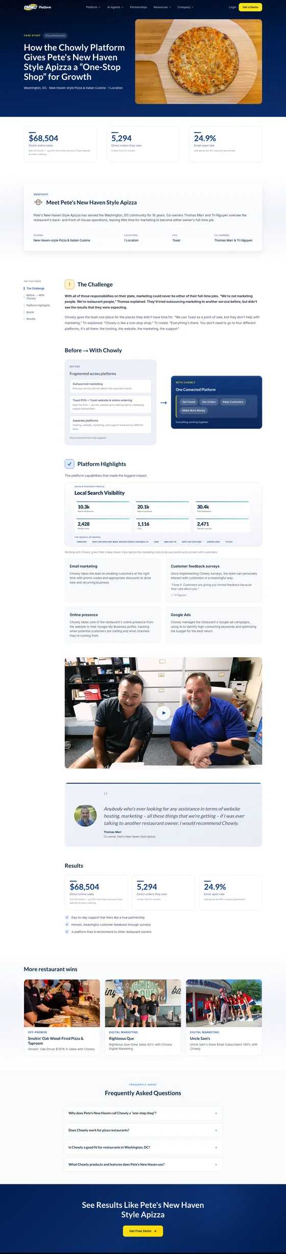
Reconstructed for this portfolio from the live page and the template rules I wrote.

See how the template is built
🔒 Lockedthe same on every case study✏️ Per restaurantfilled in for each story
Pete’s case-study page on chowly.com, top to bottom
The live page, top to bottom — chowly.com
Section🔒 Locked✏️ Per restaurant
Hero“Case study” eyebrow · three metric tilesCategory · headline with the result · location + best fact · photo · the three numbers
Snapshot“Meet …” · At a glance · Products usedLogo · owners · about · facts · which product chips
The ChallengeTitle + iconTwo paragraphs, including one bold human line
Before → With ChowlyBoth labels · “One Chowly platform” payoffThe pain points · the customer’s own phrase
Platform highlightsProduct names + default descriptionsWhich capabilities show · micro-quotes · screenshot
MediaOptional blockA video or photo — or nothing
Results“Results” titleNumbers + labels · the qualitative wins
Pull quoteStructureThe quote · name · title · headshot
More restaurant winsTitleThree story cards
Get a demo“See results like …” · button · navy gradientThe restaurant’s name

The system around it

  1. Interview

    Run by our content agency

  2. Copy brief

    My template for turning their answers into the story

  3. Template

    Locked sections + per-restaurant fields

  4. Live page

    Designed in Figma, built in code

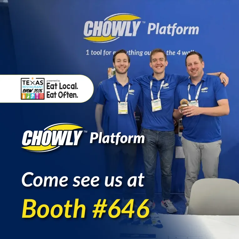
04  /  Texas Restaurant Show 2026

Designed it. Then carried it through.

Chowly exhibits at several restaurant shows a year, and I designed the graphics for them. For the 2026 Texas Restaurant Show my role went well beyond the booth: I created the visual system — backdrop, signage, print and merch — then carried it through vendors, production, warehouse shipping, exhibitor forms and logistics, plus an on-site guide for our rep.

Working back from show day

3–6 months out book the booth~1 month out lock the design and order print~3 weeks out furniture, carpet and power~10 days out freight lands at the warehouseJuly 12–13 show days in San Antonio

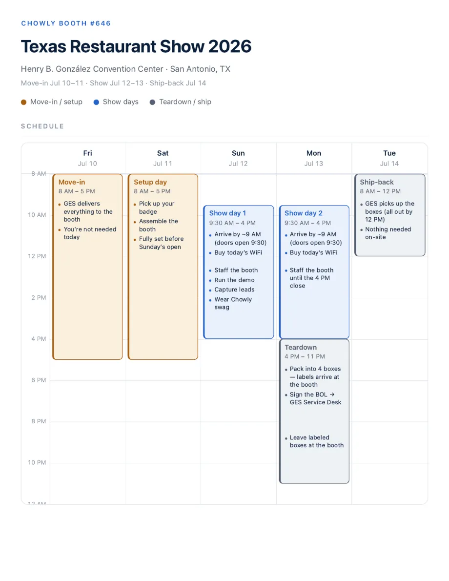
The on-site booth guide: the show schedule page
The on-site guide I designed for our rep — schedule, pack list and contacts (schedule page shown).

The playbook

The next show starts from a checklist, not a blank page.

I distilled everything from Texas into a reusable playbook:

  • A 14-step prep checklist, each step with its lead time
  • A timeline that works back from show day
  • A vendor map — who does what
  • Warehouse shipping rules and the lessons learned

The campaign

Stop Renting Customers. Own Them.

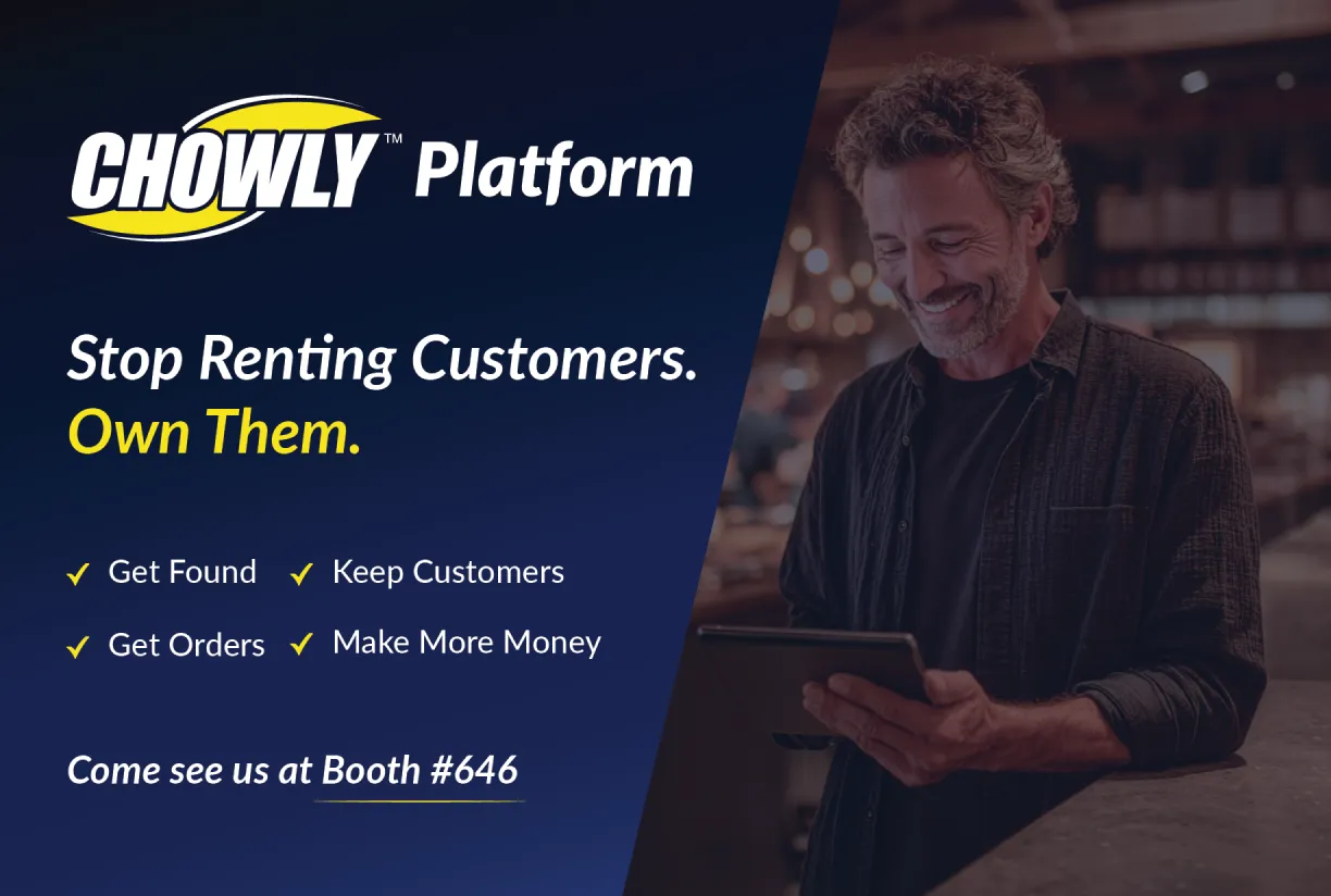
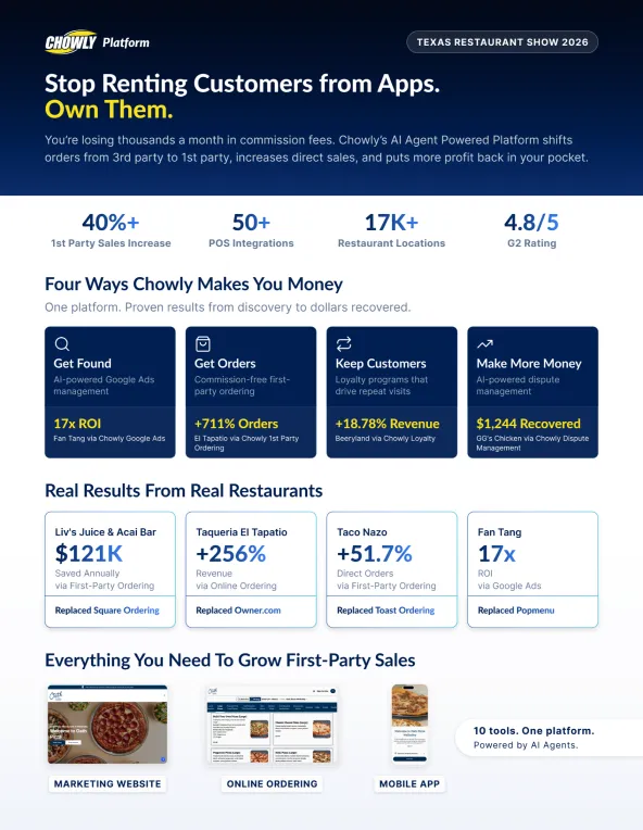
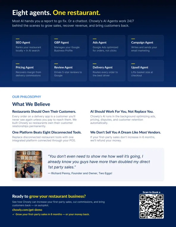
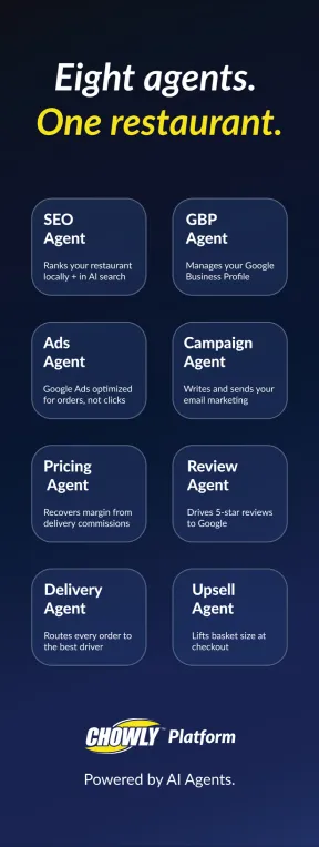
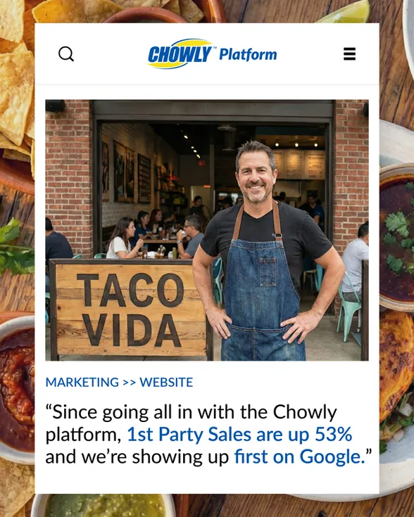
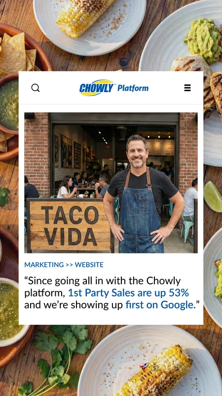
One line, carried across every surface a visitor touched — backdrop, banner, one-pager, handout, T-shirt, social.

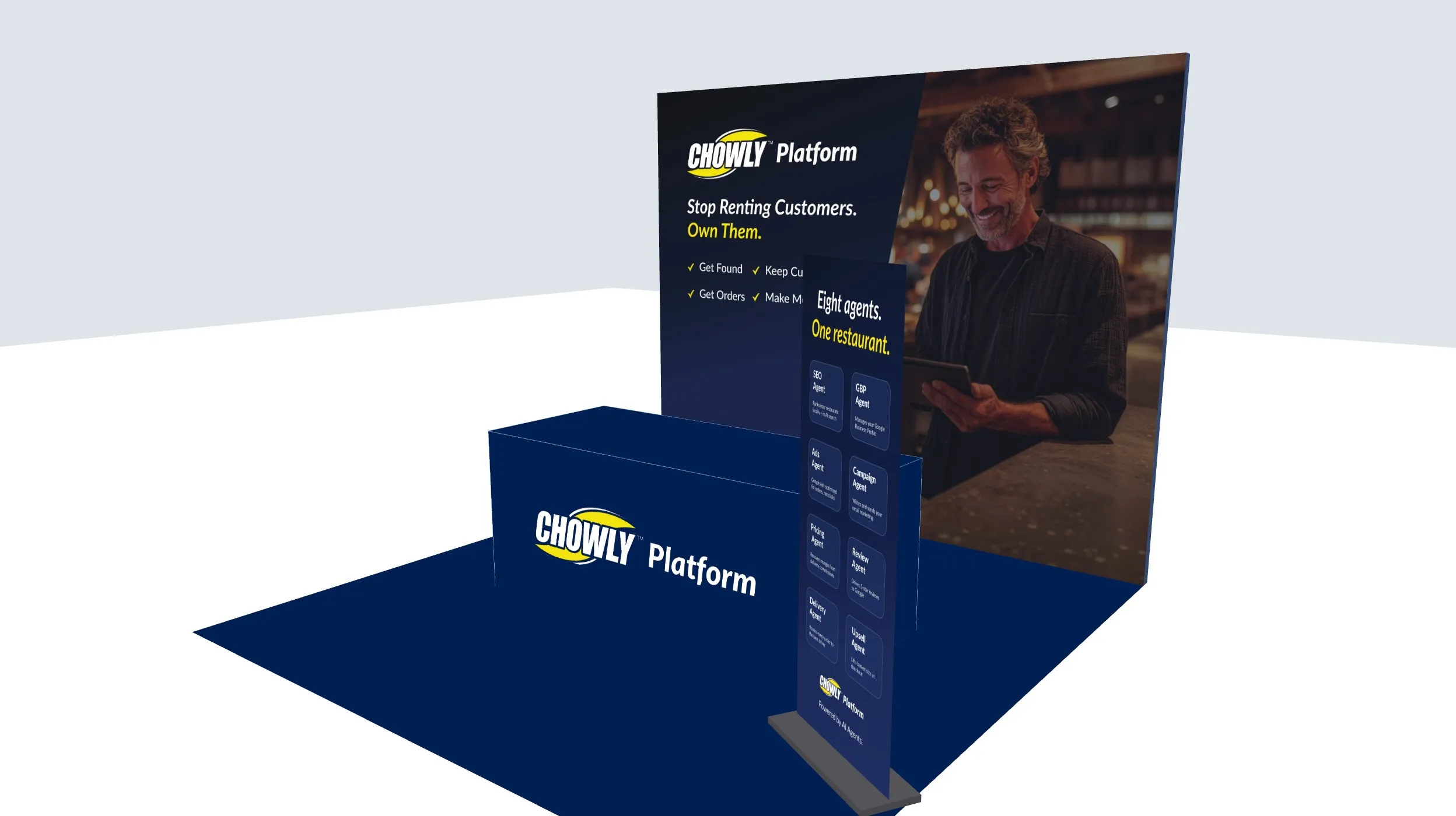
The booth — interactive 3D

A 3D render of Chowly’s 10 × 10 ft booth: the Stop Renting Customers backdrop, a draped table with the logo and an L-banner

Live in the build: drag to orbit, pinch to zoom, or jump between views — backdrop, table and pull-up banner, exactly as designed.

  • Handout — front

    Handout — front

  • Handout — back

    Handout — back

  • One-pager — front

    One-pager — front

  • One-pager — back

    One-pager — back

  • Pull-up banner

    Pull-up banner

  • Event social

    Event social

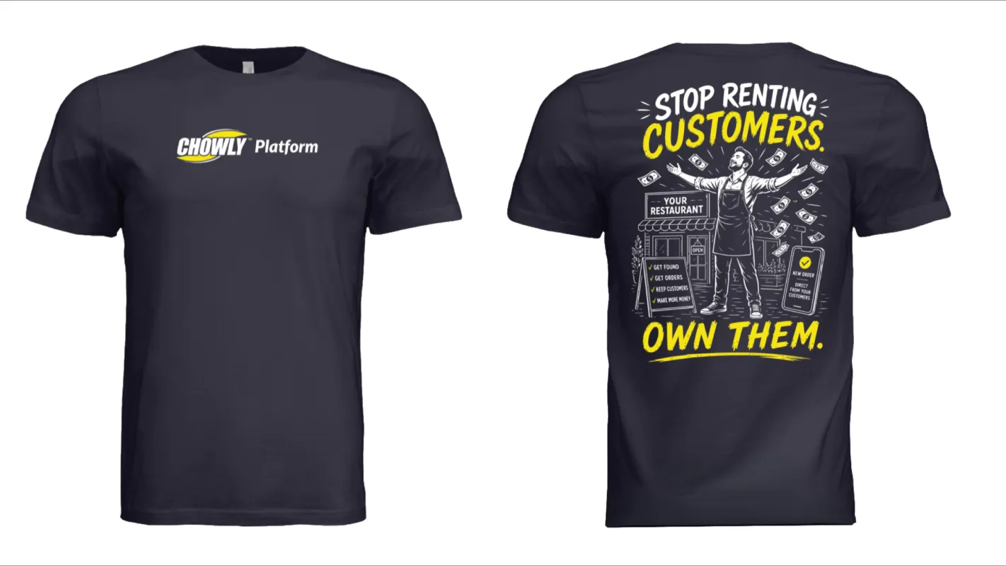
The show tee

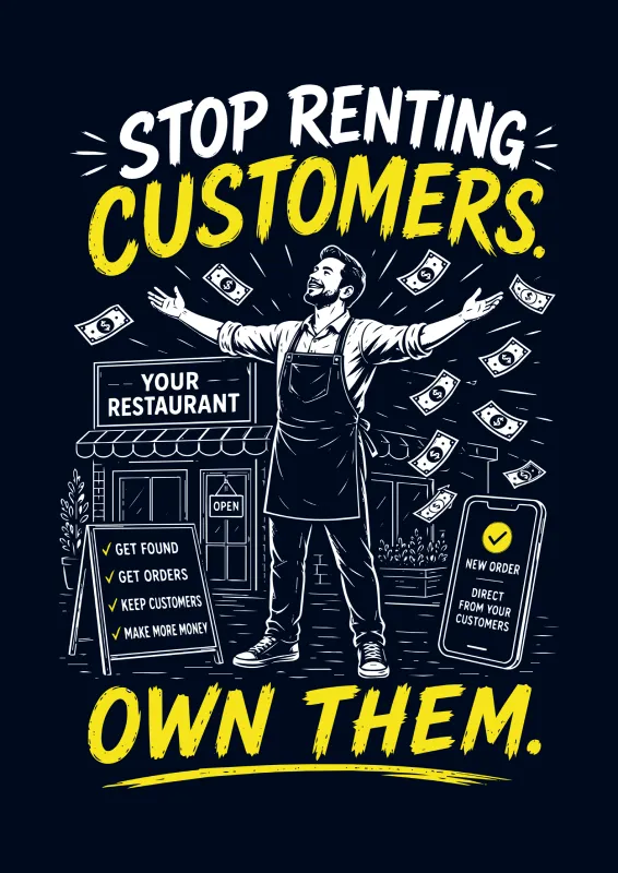
I wanted something edgy — a graphic tee to help our team stand out on the show floor. My design, made with AI help (designed, not produced).

The tee graphic: Stop Renting Customers. Own Them.
The graphic
The graphic on a navy Chowly T-shirt (mockup)
On the shirt (mockup)
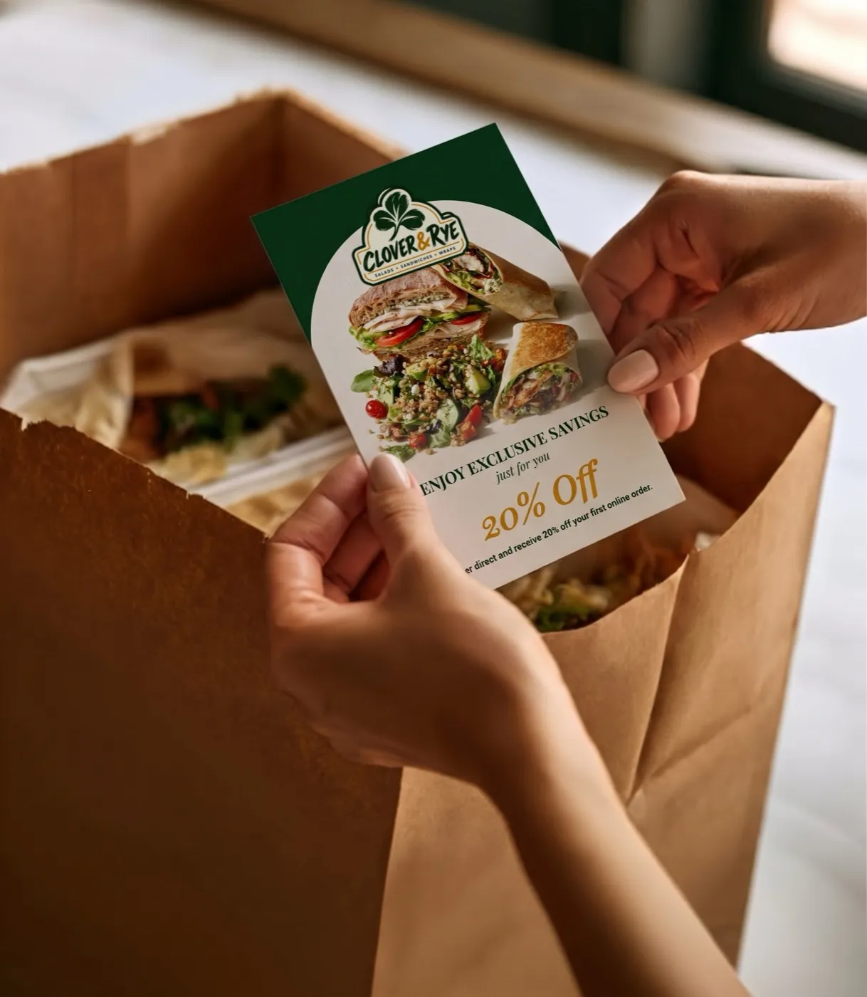
A Chowly bag-drop card for Clover & Rye tucked into a takeout bag
In the bag — a generic card I designed for this portfolio (Clover & Rye is made up), placed in a photo.

05  /  Bag drop cards

430+ cards. 280+ restaurant brands.
One designer.

A printed card that goes home in every takeout bag, pushing diners to order direct. What began as a recurring request became a high-volume program: I designed each card, managed revisions, production and reorders, and built the structure behind it — request tracking, reorder history, production records, workflow docs and, in April 2026, a master template that made every new card faster.

I ran it end to end

  1. Design
  2. Edit
  3. Order
  4. Ship
  5. Reorder

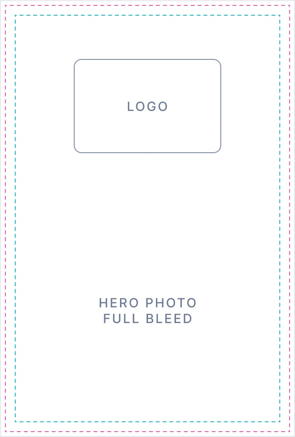
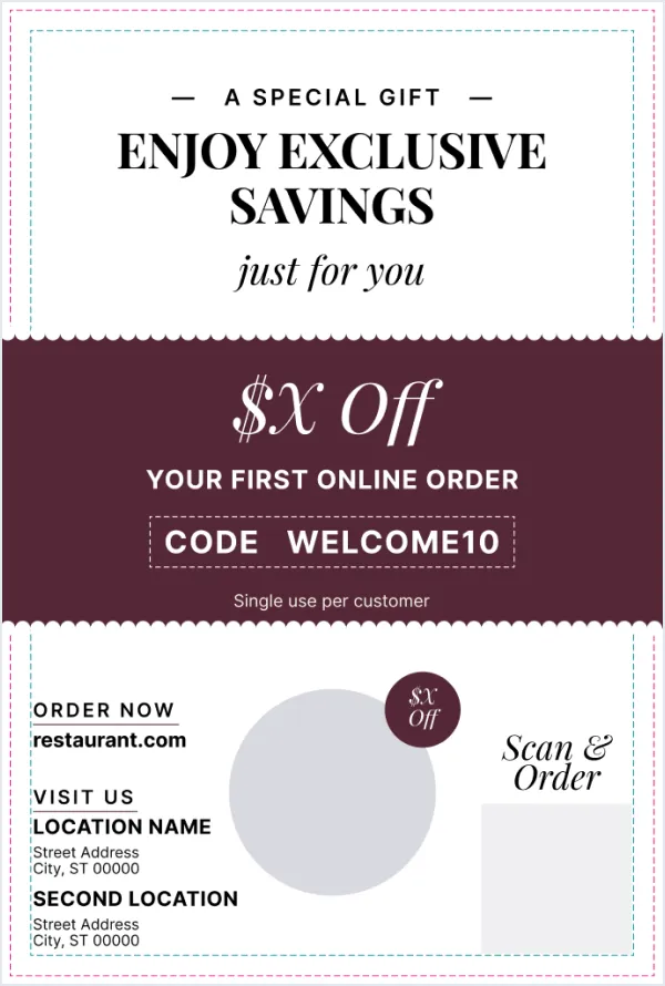
The template — front + back

One template. About ten cards a week.

Every card started from the same master file — 4 × 6 in, print-ready, layout locked. For each restaurant I only swapped in what made it theirs. That’s how one designer kept up with about ten new cards a week.

The template front: a full-bleed hero photo area with the restaurant’s logo
Front — the restaurant’s hero photo, full bleed, with their logo
The master template back: the offer, how to order, locations and a QR code
Back — the offer, how to order, where to find them, and a QR code

What each card needed

  • Restaurant name + logo
  • Website — where I pulled the hero photo and brand colors
  • Location(s) — one or two addresses
  • The offer — amount, promo code and terms
  • Where the QR code should send people

Everything else — the layout, type, scalloped coupon edges and print guides — stayed locked.

The request-form fix

Vague requests — was it “$5 off” or “5% off”? — had been reaching print. I audited the request form and pitched a redesign to the customer success team: separate fields for the offer type, amount, code and terms, instead of one free-text box. The team adopted it.
The ones I’m proudest of — front + back

Hover or tap a card to see the back. Promo codes and QR codes are blurred, since they’re live offers for real restaurants.
  • Madam Ji Ki Shaadi

  • Sushi Palace

  • Crust n Fire

  • Williamsburg Pizza

  • Gogi Yogi

  • Rocks and Drams

06  /  Content at volume

Up to ten a week.

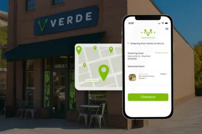
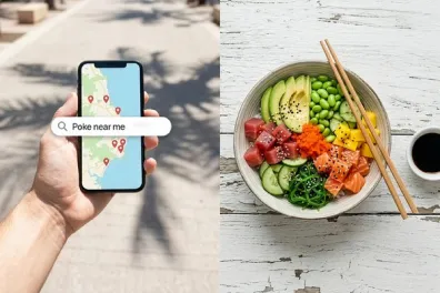
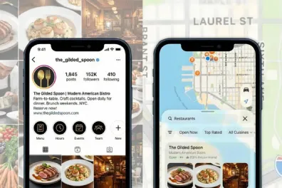
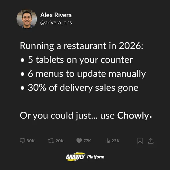
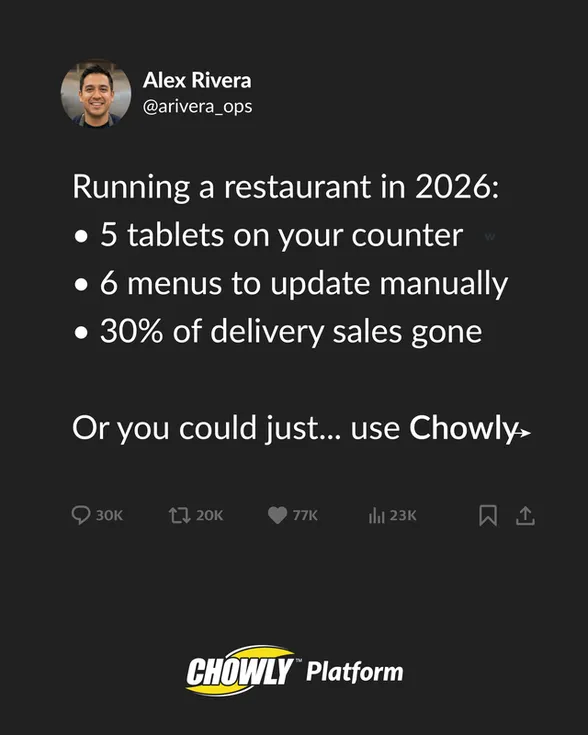
For months at a stretch, a steady run of blog thumbnails for chowly.com — five to ten new ones a week. How I make them is in 08 · How I work.

24 of the blog thumbnails I made for chowly.com.

08  /  How I work

AI accelerates. I direct.

I use AI to explore concepts, compositions and imagery faster. Generation is only the starting point — I direct the idea, iterate, and finish the work in my design tools until it’s specific to the brand.

AI scene → real screen → final

AI gave me the scene. The screen is real.

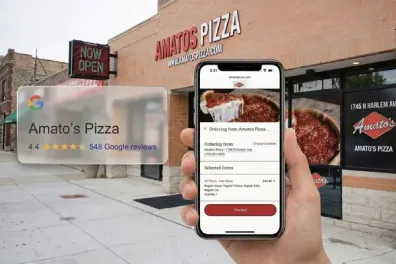
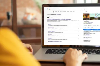
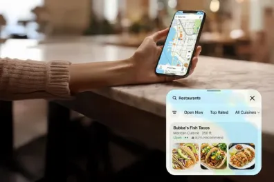
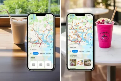
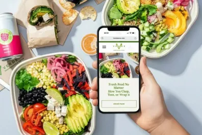
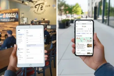
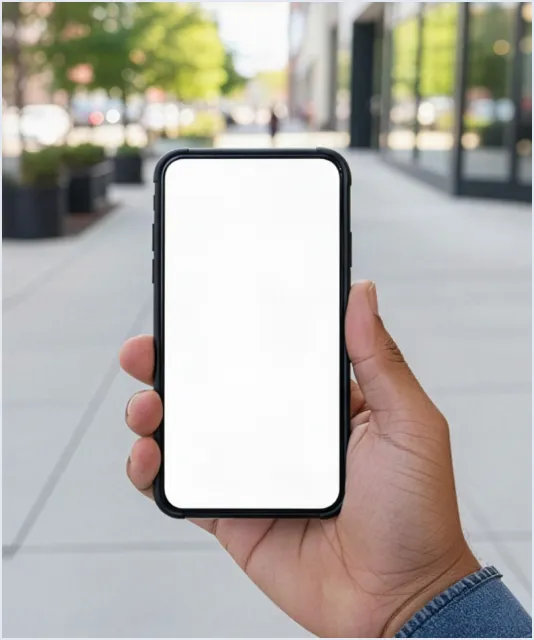
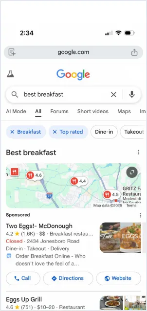
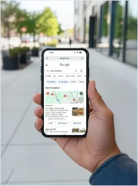
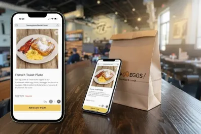
For customer blog images I generated the setting with AI, then dropped in real screenshots of the restaurant’s own site or Google listing — so the screen shows a real Chowly customer, not a made-up one.

Two Eggs — getting found on Google

  1. AI scene — a blank phone

    1 · AI scene — a blank phone

  2. Real screenshot — Google “best breakfast”

    2 · Real screenshot — Google “best breakfast”

  3. Final — the real listing on the phone

    3 · Final — the real listing on the phone

AI video

An AI presenter, directed.

A 28-second vertical video for Two Eggs and Chowly. I wrote the script; the presenter is an AI avatar, and I directed it and built the video around Chowly’s branding.

09  /  In closing

Real company. Real constraints. Real growth.

I came to Chowly focused on making strong individual pieces. The role pushed me to think about how a brand works across teams, channels, tools and time — and I left with a practice that moves between the work and the structure around it: the asset, the framework, and the documentation that carries it forward.

Shared with care: this is work I created at Chowly. Public‑facing pieces are shown where possible; live promo and QR codes are blurred, and private customer details, logins, pricing and internal costs are left out.

NextWolfpack